Archive for the ‘User Interface’ Category
Friday, October 1st, 2010 by Jesper Rønn-Jensen
I have a reading proposal for you: Marc Hedlund’s “Why Wesabe Lost to Mint“. Wesabe and Mint were competing to be the best free web-based personal financial management services. In retrospect, he has some insightful notes on how important end user experience turned out to be: […] Mint focused on making the user do almost […]
Posted in User Interface | 1 Comment »
Sunday, February 1st, 2009 by Jesper Rønn-Jensen
It took me a little while to use the new file deletion principle from Google Groups administrator. You see the list of files, then click delete on the row you want to delete.The row then appears “selected” (the darker colored rows at the bottom). What confused me was that it still says “delete” followed by […]
Tags: google, Usability
Posted in Usability, User Interface | 6 Comments »
Wednesday, January 28th, 2009 by Jesper Rønn-Jensen
In general it’s good to use the human time formats (1 hour ago, 2 months ago, etc.) that you see in many of the new web applications. In general, the detail level is up the shorter the time span.

Tags: format, human, jaiku, time, Usability
Posted in Usability, User Interface | 9 Comments »
Tuesday, March 11th, 2008 by Jesper Rønn-Jensen
I really fell in spontaneous love with this drawing, that shows the relation between the simplest and the most complex of all known products and websites. Apple and Google representing the first. Internal Enterpricey applications representing the latter. Thanks a lot Eric Burke for that fantastic visualisation! A great quote that fits for this situation: […]
Posted in User Interface | 6 Comments »
Monday, January 21st, 2008 by Jesper Rønn-Jensen
For a work project I had to make a “send email to a friend”, and looked for inspiration the following places. I’m not commenting it here, these are just the raw examples I found. If you like feel free to comment on what you like or don’t like, and please add links to research that […]
Posted in Links, User Interface | 8 Comments »
Tuesday, September 11th, 2007 by Jesper Rønn-Jensen
You might know this example. It works this way in Adobe Photoshop. Drag to adjust numberic value Mouseover the input box, hold down Cmd + drag left or right to increase / decrease. Hold down Cmd + Opt or Shift key and drag can change the value in decimal or 10 interval. This shortcut works […]
Posted in Productivity, Usability, User Interface | 2 Comments »
Monday, September 3rd, 2007 by Jesper Rønn-Jensen
Last week our old DVD player stopped working, and we decided it was time for a technological quantum leap. So I ordered this DVD/harddisk recorder: Amitech 736 with all the right buzzword features: DVD player/recorder Built-in harddisk (I ordered the 250GB version) Digital tuner as a supplement to the analog tuner (better quality of recordings) […]
Posted in User experience, User Interface | 10 Comments »
Wednesday, June 6th, 2007 by Jesper Rønn-Jensen
Via Kareem Mayan’s blog, I came across this story from 1982, when the Apple Lisa team decided upon using “OK” on the confirmation buttons in stead of “Do It”: When the software required confirmation from the user, it displayed a small window called a “dialog box”, that contained a question, and presented two buttons, for […]
Posted in User Interface | 4 Comments »
Tuesday, May 15th, 2007 by Thomas Watson Steen
Yesterday BBC published a short article entitled “Web 2.0 ‘neglecting good design’“. The journalist apparently attended a talk by Jakob Nielsen where he talked about usability issues in Web 2.0. The article is basically just a summary of the talk, and the main focus is that many websites, in the rush to be more Web […]
Posted in Usability, User Interface, Web Development | 12 Comments »
Monday, May 7th, 2007 by Jesper Rønn-Jensen
Why is it that my laptop gives me this warning:
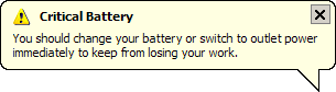
AFTER the computer shuts down, so I see it when I plug it in and turn it on again?
Posted in Humor, Usability, User Interface | 2 Comments »
Saturday, May 5th, 2007 by Jesper Rønn-Jensen
In my opinion, the autocomplete input boxes have a very low discoverability because they’re basically just textfields with added JavaScript. Google Suggest’s interface has an added line of text trying to explain and to make it easier to discover the _hidden_ functionality: “As you type, Google will offer suggestions. Use the arrow keys to navigate […]
Posted in Usability, User Interface | 8 Comments »
Thursday, May 3rd, 2007 by Jesper Rønn-Jensen
Many of today have extremely advanced features and functionality. But the trend towards simpler, slicker user interfaces points towards hiding some of the functionality. Hiding functionality is — in my point of view — a very good thing for usability.
A usable website (or application) is:
- easy to use
- easy to learn
- hard to make errors in
Posted in Usability, User Interface | 3 Comments »
Thursday, April 19th, 2007 by Thomas Watson Steen
One of the cornerstones in Web 2.0 are the folksonomy, a user generated taxonomy, popularly referred to as tags. Google made tags popular (they call them labels) when they launched Gmail (taxonomy) and the online bookmark service del.icio.us gave us tags + social network = folksonomy. Today Mozilla launched their e-mail client ‘Mozilla Thunderbird 2’ […]
Posted in E-mails, Taxonomy, Usability, User Interface | 1 Comment »
Wednesday, February 21st, 2007 by Jesper Rønn-Jensen
Chris McEvoy has some good and thorough observations around the inconsistencies in Google’s menues. Even though the menus are extremely simple, they seem to differ on most of the 26 sites mentioned. Below are Chris’ observations from his article A to z of Google Information Architecture: Here are 26 different sets of menu items for […]
Posted in Usability, User Interface | 9 Comments »
Thursday, December 21st, 2006 by Jesper Rønn-Jensen
Recently I was recommended taking a look at CrazyEgg which could be a possible candidate for creating heatmaps of user navigation. Rather than to be specific to CrazyEgg, I would like to comment on the general principles and pitfalls when using the methodology that CrazyEgg uses. Heatmap (from CrazyEgg demo site) As I understand, it […]
Posted in justaddwater.dk, Usability, User Interface | 14 Comments »
Friday, December 15th, 2006 by Jesper Rønn-Jensen
The new Google Finance has introduced the simplest “import” feature I have ever seen. Just have a look at this promise right above a big text field for inputting data from other finance sites. Copy your portfolio from any site and paste it into the form below. Be sure to get the column headers. One […]
Posted in Usability, User Interface | 11 Comments »
Thursday, December 14th, 2006 by Thomas Watson Steen
I just saw the very funny usability video called ‘Lexus Self-Parking “Usability” Test‘ (via Matthew Oliphant). Car manufactures stuff more and more electronic gear into our ‘intelligent’ cars – But how does that effect the user experience? The fellas in the video are not impressed. They even get into a fight over how to operate […]
Posted in Humor, Usability, User Interface | 18 Comments »
Wednesday, December 6th, 2006 by Jesper Rønn-Jensen
Joseph Cooney found a fantastic example of a confusing user interface. (via Jeff Atwood). In a comment on Atwood’s blog, Aaron G adds: The people saying that the UI is good “for people who know wget” are only reinforcing my original point that it provides no useful abstraction to wget and is hence useless as […]
Posted in justaddwater.dk, User Interface | 3 Comments »
Tuesday, November 28th, 2006 by Jesper Rønn-Jensen
Here is an example from Amazon.com, on how to encourage people to participate. Users have to vote for the deal they like the best. This way, people are encouraged to do an active act. Unless you vote for it, you’re not even able to buy it for that price. Very encouraging. Amazon could really collect […]
Posted in Usability, User Interface | Comments Off on Usability tip: Amazon Vote for Deal Feature
Monday, November 27th, 2006 by Jesper Rønn-Jensen
The other day I noted that the Restart button in Windows probably appeared because of buggy software. It was a frequent task that people used often, hence there was a value in combining the two steps (shut down, then start) into one Restart action. This is a lot like the “save” button, where I heard […]
Posted in Usability, User Interface | 8 Comments »
Sunday, November 26th, 2006 by Jesper Rønn-Jensen
Below is my argument that some user interface widgets are introduced only because of buggy software. First let’s have a look at Windows Vista. Joel Spolsky is picking on the 24 people that designed the Off button in Windows Vista: Choices = Headaches. I’m sure there’s a whole team of UI designers, programmers, and testers […]
Posted in Usability, User Interface | 9 Comments »
Friday, November 24th, 2006 by Jesper Rønn-Jensen
The most influential talk I have heard this year is Barry Schwartz on the paradox of choice. I cannot recommend this talk enough, so I was thrilled to see that Barry did a similar talk that’s available on Google Video. Google TechTalks April 27, 2006 Barry Schwartz Paradox of Choice (one hour video). If you’re […]
Posted in ui11, Usability, User experience, User Interface | 7 Comments »
Wednesday, November 22nd, 2006 by Jesper Rønn-Jensen
I was asked today on which best practices exist in documenting user interfaces. Especially with focus on documenting how and where the user interface (GUI) communicates with backend services. The format I usually use is: Screenshot Description Preconditions Postconditions Explanation: Screenshot of the entire page or content area Description of the page purpose. Primary action […]
Posted in Best of Justaddwater, User Interface | 7 Comments »
Thursday, November 16th, 2006 by Jesper Rønn-Jensen
Daniel Szuc tipped me about The Usability Toolkit, now available from Sitepoint. I just ordered a set, and I’m really looking forward to this, as I remember Daniel mentioned the toolkit when I met him at UI 11 last month. Understand usability and get the tools to put it into practice Learn the essentials with […]
Posted in Usability, User Interface, Web Development | 2 Comments »
Monday, November 13th, 2006 by Thomas Watson Steen
Jensen Harris who’s the Group Manager of the Microsoft Office User Experience Team has for the past year been blogging about the new and exiting user interface of upcoming Office 2007. The new user interface is a complete redesign of the old Office that users have been accustomed to for years. I’ve taken the liberty […]
Posted in User Interface | 1 Comment »
Saturday, September 2nd, 2006 by Jesper Rønn-Jensen
I asked for numbers confirming my thoughts recently in “Design for Browser Size — Not Screen Size“. First Jakob Skjerning (mentalized.net), and now Thomas Baekdal published his preliminary results. Great to see some thorough work done in this highly important area where pretty much no stat tool or measuring service have ever been. For years […]
Posted in Browser, justaddwater.dk, Usability, User Interface | 4 Comments »
Monday, August 28th, 2006 by Jesper Rønn-Jensen
The Internet Explorer team is preparing to ship the next major version of the world’s most popular browser. The IE team has written an update on which CSS bugfixes that will make it into the final release. Update of existing CSS on websites Before we get to that rather long list, I feel it’s important […]
Posted in Browser, CSS, User Interface, Web Development, Web Standards | 9 Comments »
Thursday, August 17th, 2006 by Jesper Rønn-Jensen
Jakob Nielsen discusses screen resolution and page layout in a recent Alertbox article. As usual, Jakob offers some decent facts and clear guidelines on which screen resolution to design for.
I have the deepest respect for Jakob Nielsen and the work he does to make usability easier to understand and use for everybody. There is just one problem: Findings should focus on browser window size and not screen size.
Posted in Best of Justaddwater, Browser, Usability, User Interface | 45 Comments »
Sunday, June 25th, 2006 by Luis Villa
Hi, this is Luis Villa, Thomas and Jesper’s former colleague at Capgemini Spain. They couldn’t make it to @media in London last week, so they asked me to give a summary of the event. London @media 2006 was a Conference about frontend and web user interface in all its dimensions: strategy, design and building and […]
Posted in Accessibility, AJAX, Events/seminars, User experience, User Interface, Web Development, Web Standards | 9 Comments »
Thursday, June 22nd, 2006 by Jesper Rønn-Jensen
Here is an example of a smart country selector. From installation of an Ipod Nano. The usability principle is called progressive disclosure: First, display the most typical settings, then give the ability to show all in the special cases. Several things I like with this approach: Progressive disclosure: Don’t clutter screen with options that only matter to […]
Posted in Forms, Usability, User Interface | 1 Comment »
Monday, June 12th, 2006 by Jesper Rønn-Jensen
How to let ordinary people make wise predictions for you better than experts. The Wisdom of Crowds by James Surowiecki digs into that phrase and gives excellent examples of how it can be used on the web. I wrote about it earlier after hearing James Surowiecki on MP3 from SxSW. Two weeks ago, Boxes and […]
Posted in Links, Usability, User Interface | 3 Comments »
