Jesper’s Notes, "Elements of User Experience"
Jesper’s notes from Jesse James Garrett’s event “The elements of User Experience” in Copenhagen, Denmark, May 31, 2006.

Compares User Experience to the experience at going to the movies. Worst movie experience ever. “I cannot walk out of a movie”. Why are we still seeing bad movies?
- Lots of experience
- Bad experience acting
- Takes a lot of skills and practice to get every detail right
People talk alot about bad movie experience. But if they have a bad experience at a website, they don’t talk about it. They blame themseves.
- “I probably overlooked the right choice”
- “I guess I’m not smart enough to use this”
Success metrics:
- The only way to know if changing your site has made a difference
- Closely tied to site objectives
Show of hands: Who’s conducting user research in their company:
- Almost noone (unless a few consultants in the crowd)
Personas
Good example: Intranet, start with roles as personas. Take a step back and look at it. People with different roles have similar behaviour even though they are at different places in the organisations.
Companies can find out that they may not know their users sa good as they think they do. Personas get created for a specific project, but can start wander around and suddenly pop up different places in the organisation.
Example: At a cristmas party, the executives stood up and did a scetch and started playing the personas.
One danger: Inventing the personas characters instead of base them on research. Too much focus on specific details we invented. Example “helping her getting out of the divorce…”
The scope plane
Functional specifications:
- What are the features/functions that users need to fulfill their goals
- Focus on that it does
- not “how it works”
- Not technical document
Content requirements
- Who’s responsible
- Define elements according to their purpose (user goals). NOT “video streaming”, etc.
Documentation
- Problem with how organisations use them
- “waste of time”
- No one reads them
- Never up-to-date
If you lock people in your organisation into a room, then “off course its a waste of time”, etc…
Solution to use documentation as part of decisions, meetings, etc.
“Comedy is tragedy plus distance”
“Employee forced me to do documentation”…
The bus factor: What’s the risc to the project if a project member gets hit by a bus.
Structure
Take the functional goals and map out how the users going to move throug these things.
Interaction: It’s about the actions that user can take with the system. interaction design.
Information architecture: Defines relationships between content elements
Documenting structure: Visual representations tend to work best. Design for your audience.
jjg: “I usually have a visual document and in front of that a two page summary for management. Management tend to get confused by too much detail!”
http://jjg.net/ia/visvocab
Skeleton
Information design: How we present this information so that people understand and use it.
Information design is a big issues in design of maps.
Show San Fransisco map for visitors. Map for people who live there: Busses and trains. The map emphasizes different things of importance.
Favorite SF map: San Fansisco bicycle map. Three different shades of red represent how steep the incline is.
Interface design: Provides a means for users to interact with application functionality.
Navigation design: Brings all skeleton issues into one hight-level “scetch”: wireframe
The surface plane
Visual design. Not just about making pretty: Lot of choices. Example Orbitz: Decision about color palette. Consisten use of color palette throughout the site.
Other example: Apple.com use of typhography. Apple Garamond for headlines/eye catchers. Lucida grande, Geneva…
The elements applied
Example: A site-wide search engine.
Strategy: Balances user needs and site objectives
Scope (functional): keyword entry, other fields for specifying, perhaps also to narrow result set.
Scope (content): Labelling, …
Structure: system behaviour: What if: No results, too many results, can’t connect to database.
Skeleton: layout of search result, error conditions. Navigation in and out of search results.
Surface: Visual design, color, typography, layout.
Comparison Apple search results with IBM. Very different although they have almost identical functionality.

Answering objections
- “Our market research tells us everything we need to know about our users”
— market research are not aimed at user ##adfærd## - “We’ll follow this list of guidelines from the internet”
— no, we need to be specific
The value of user research: We’re continuous surprised.
jjg: “No one would ever suggest improvising a bridge, improvising a hotel. But we see that constantly on the web.”
- We’ll fix it in QA. (but that’s probably too late)
Bad signs
- Design by default (usually engineers)
- Design by mimicry. “remember the plague by tab navigation”
- Design by fiat: It’s going to be purple, because I like purple.
The Marathon and the Sprint
Sprint is a short race:
- strategy: get a quick start
- burn energy as quickly as possible
Marathon is a logn race
- Pace yourself
- Choose when to burn energy
Ask yourself Which race are you trying to run?
- If you try to run a sprint as a marathon, you’ll finish last
- If you try to run a marathon as a sprint, you’ll never finish
The visual vocabulary
Architecture diagrams
- Effectively communicating the big experience
- One context for all the design desicions we make
- The “trophy deliverable”: The one thing, the client is most likely to print out large scale and point to on the wall:
“This is what we’re building”
jjg: A document that’s not getting used, is a waste of time. I always deliver my documents electronically so that they’re easier to copy from and use.
Use color as a redundant information only (so it can be printed in black/white, photocopied.
The vocabulary are standard shapes to express common concepts.
jjg:”people make fun of me because when we go into a meeting room I always take the seat closest to the whiteboard”
- Tool agnostic (works even in powerpoint)
- Whiteboard-compatible (so quick sketching of shapes are easily distinct)
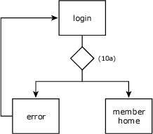
Figure 10: An example use of a decision point in a login sequence
From http://www.jjg.net/ia/visvocab/
Reverse engineering
jjg made a map of Yahoo! Mail (handout notes). “If I were a competitor of Yahoo! I could reverse engineer my way though the application and see all decisions Yahoo! made”
The map only addresses the user experience.
Example: 1990 Borland Quattro (Lotus 1-2-3 compatibility mode) . Click on a switch and application reconfigured itself
- Lotus suited Borland over menu stucture
- Deadlocked 4-4 in Supreme Court
Other example: Apple paid Amazon to use the 1-click in their Apple Store (or was it ITunes).
Nine pillars
How many people are nine-pillar people?
Spot the Information Architecture
Photo of Times Square: Find Waldo!
In the beginning there was one datum. Later more data possibly related. Possibilities emerge. Illustrations. All these possiblilities only with two.
Information Architecture in a restaurant menu. Essentially a wireframe of the restarurant menu.
Harper’s Index example: Relationship between severity of crime and severity of punishment . Relationship between intention and action => Juxtaposition
Radio roadmap for every thing that happens during a radio program. The worst thing that can happen on radio is total silence.
Lands’ end catalog: “Catalog I get with alarming frequency”. 60 pages long, no sections. It has IA — an implicit IA.
No section breaks, no headings. You just flip the page and you’re on to something else. Repetition of elements. Same element presented differently on page 4 and page 15.
Technology definition:
- Tech: “skill or method”
- Nology: “Knowledge or study”
- Technology = knowhow (ideas, methods)
The adoption Curve by Geffrey Moore (crossing the chasm)
Technology is spread by social interaction with the inventors.
JJG: “Technology is a social disease”
Jurassic park movie poster “something has survived”: Jeff Bezos and Jakob Nielsen:
Amazon defies conventional Wisdom
Relentless algorithmic architectures
Metrics, metrics, metrics.
- People who bought this also bought…
- The page you made…
- Your store…
- Your recommendations…
- Explore similar items…
This is only the beginning of algorihtmic architecture. We will see systems that create algorithmic architecture.
The modern webdesigner: Mister Magoo

“Jakob Nielsen sells canes to the blind”. We need better. We need technology that make us able to see. Like the guy in Startrek.
- real data,
- better data about actual user behaviour,
- we need the interfaces we build to tell us more about what real users experience with real website.
Amazon algorithms have different tags according to which algorithms are used to get you to the item.
- ref=sr_2_2
- ref=sr_1_1
- Able to track which features drive traffic, revenue.
Baseball statistics
They started pretty simple. But now it’s so complex that only experts understand it.
On web, the data is pretty simple.
Imagine physical store where a person jumps out behind you, takes notes of everything you look at, pick up, where youre going, what you buy. The next time you get back in the store, everything is arranged conveniently for you. Imaging the potential.
Adaption curve: Hackers and hobbyists.
- All this is non-commercial
- ecosystems between hackers and hobbyists
- rapid iteration
Side project: Flickr, del.icio.us => deploying code 3-4 times a day, constantly monitoring feedback.
Questions
Q: Social bookmarking. voting gets fed into various algorithms??
A:How much can we allow the page to change. User participation drives user engagement. But low threshold pulls in much larger audience.
Social Tagging example on website pages. British Government “Ticker problems” no one found it. Couple of houndred taggings on “Ticker problems” made them change page title.
Q: patents on recomendation algorithms
A: Amazon public API, Swedish company can give recommendations if you give them feedback.
Q: Search. analytics completely overlooked.
A: You tell the user to type what they want, and then you don’t look what they search for. There is huge potential /market for analyzing search results. As a guide for new content, etc.
Q: AJAX
A: visual vocabulary can work here. The trick is: I use the word “page”. Rather applied to a “state” in the user experience.
Also, storyboarding, but you can’t get lots of details into it.The number of possible states multiplies. Trick: Find major stories.
Axure rapid protoyping tool (creuna) for prototyping AJAX applications.
A: Crude animations of photoshop files works for Adaptive Path
— end with informal cocktail hour —
Technorati Tags: event, seminar, jesse james garrett, adaptive path, copenhagen, denmark, reboot, reboot8, snitker

June 19th, 2006 at 00:15 (GMT-1)
See also the notes from Jesse’s talk at Reboot next day. Kindly posted by: Leapfrog, Henrik Føhns, Sean.
July 3rd, 2009 at 02:47 (GMT-1)
“If I were a competitor of Yahoo! I could reverse engineer my way though the application and see all decisions Yahoo! made” – I did really like this sentence… quite inspiring!
thanks for the article…