The Design of Internal Enterprise Applications
I really fell in spontaneous love with this drawing, that shows the relation between the simplest and the most complex of all known products and websites. Apple and Google representing the first. Internal Enterpricey applications representing the latter.
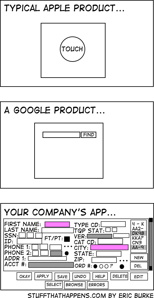
Thanks a lot Eric Burke for that fantastic visualisation!
A great quote that fits for this situation:
“Life is really simple, but we insist on making it complicated” (Confucius)
More quotes: Great Quotes For The Agile Project Wall
Technorati Tags: simplicity, complexity, cartoon, stuffthathappens

March 14th, 2008 at 16:22 (GMT-1)
[…] The Design of Internal Enterprise Applications […]
March 23rd, 2008 at 17:26 (GMT-1)
[…] to find a giant, affordable touch screen? The Design of Internal Enterprise Applications Internal Capgemini Scrum […]
March 24th, 2008 at 10:03 (GMT-1)
[…] Via: JustaddWater.dk […]
March 24th, 2008 at 11:27 (GMT-1)
[…] Application design. […]
April 18th, 2008 at 10:00 (GMT-1)
Nice.
A. Apple: because you’re willing to spend twice the price on a machine (vs. PC) that a lot more design/usability work went into.
B. Google: Because even Google founders admit that in the beginning, they did not have a search button because they did not know how to make one. Google is still a one-trick-pony (search).
C. Because you need to make money. SCreenshot #3 is what you would see in google or apple’s backend.
March 10th, 2010 at 00:49 (GMT-1)
So true. We love the saying, “confuse ’em and lose ’em”. It’s clear that simplicity rules over complicated and confusing things – even when it comes to design, development, applications, etc….thanks for the illustrations – love them!