Form usability: A smart country list
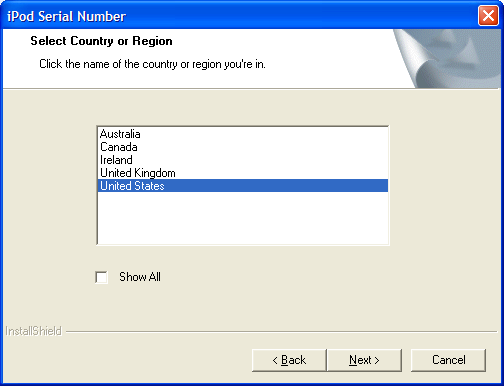
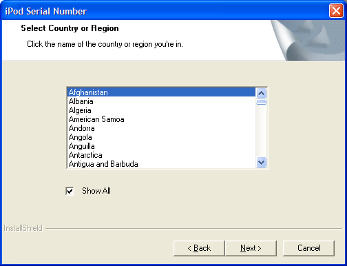
Here is an example of a smart country selector. From installation of an Ipod Nano. The usability principle is called progressive disclosure: First, display the most typical settings, then give the ability to show all in the special cases.
Several things I like with this approach:
- Progressive disclosure: Don’t clutter screen with options that only matter to few people.
- Initial state is so simple: Because of progressive disclosure, the options are easily
- It’s not a selectbox: Too often I see countries list implemented as a selectbox. In my opinion, selectboxes should generally not be used for more than 20 options. (By selectbox I mean the selectbox rendered as a single line. I realize that the screenshots above shows a listbox with ten visible options, but the real principle is that it’s not relevant to use it unless you’ve clicked “show all”)
Background info on progressive disclosure from Wikipedia, Usability first, UI Patterns, Macromedia, Microsoft.
More on form usability: I’m looking for more examples of form usability, please give suggestions and screenshots if you have any ideas.
Technorati Tags: usability, user interface, form, forms, progressive disclosure, country selector
