Interaction Design Experiment: Delete Row
It took me a little while to use the new file deletion principle from Google Groups administrator.
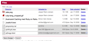
You see the list of files, then click delete on the row you want to delete.The row then appears “selected” (the darker colored rows at the bottom). What confused me was that it still says “delete” followed by an “X” icon that usually means “delete”.
Now, to to delete, press “save changes” below the rows.
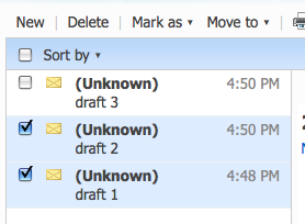
This layout is close to the old-school principle with checkboxes adjacent to the rows. This example is seen in Hotmail (where I think it originated 13 years ago).
In my opinion, the new Google Groups style mass deletion could do better:
First, the selected rows must have visual clue that it will be “deleted” — not a “delete” action (icon) that suggests further interaction is needed.
Second, change wording on button to “delete selected messages”. Or, better yet: The button should be permanently disabled and enabled only when at least one row is selected.


February 1st, 2009 at 23:42 (GMT-1)
Better yet: make it so that a click on the “delete” link, deletes the message from the list without a page refresh. Make it dissapear visually, and move the item to the trash. (even that movement could be made visual with a little AJAX). I don’t like the ‘click-three times to delete something’-approach.
February 2nd, 2009 at 13:26 (GMT-1)
@prullenbak: Often I prefer the way you describe it. But it can backfire if for instance a confirmation box is required. In this case, you will end up clicking 3 are-you-sure-confirmations when deleting 3 rows.
So it really depends on the nature of the data. To take it even further, i’d like to combine your “just delete” description with ability to undo deletions. This would yield the smallest number of clicks and an ability to revert destructive actions.
February 7th, 2009 at 22:27 (GMT-1)
I share exactly your opinion, Jesper. No more questions but undo option (better: unlimited undo history)!
The “Never Use a Warning When you Mean Undo” article was imho one of the most important articles on ALA.
February 9th, 2009 at 16:33 (GMT-1)
[…] Interaction Design Experiment: Delete Row […]
September 13th, 2009 at 20:34 (GMT-1)
I find that a lot of the Google products behave as though they were created by a group of very smart but slightly detached engineers. They’re often very rich in features but lack the elegant simplicity that would make them easy to learn.