Affordance of Autocomplete Text Fields
In my opinion, the autocomplete input boxes have a very low discoverability because they’re basically just textfields with added JavaScript.
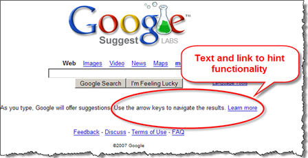
Google Suggest’s interface has an added line of text trying to explain and to make it easier to discover the _hidden_ functionality: “As you type, Google will offer suggestions. Use the arrow keys to navigate the results. Learn more”:
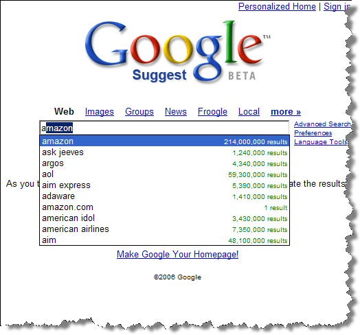
And as soon as you start typing, the results will appear as shown below:
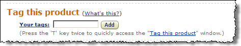
Another example is Amazon’s “tag this product feature”. As I wrote previously, it has affordance as to which keyboard shortcut can show the dialog. But as you type in the field, there is no hints to make it obvious that this field can magically help the user by autocompleting.
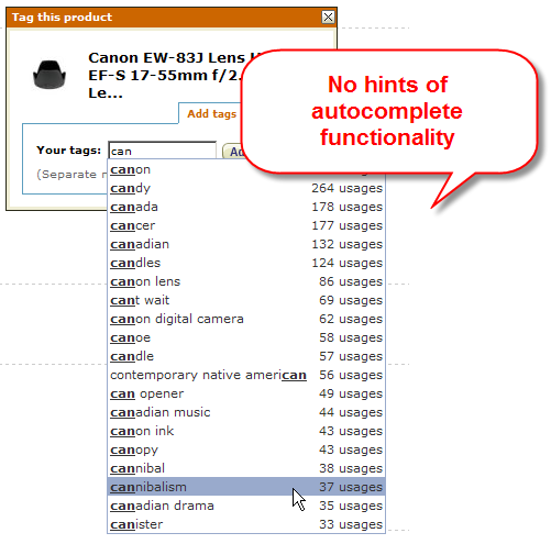
(totally unrelated, i suddenly feel very curious about what products are tagged with “cannibalism”…)
Kayak.com also has autocomplete fields in case you foroget that airport code. Which is actually cool, but again not hints before you start.

Yahoo!s Design Pattern Library has one autocomplete example from the recent Yahoo! Mail beta:

The screenshot used for example has no affordance to hint the hidden functionality. There is also nothing describing the availability of automplete functionality.
Outlook and Excel have sort of autocomplete as well. But compared to the examples above (where suggestions appear if you hesitate typically a second), then the suggestions appear immediately.
Is it good enough to have no visual indication? Hardly. I would like to see a general consensus around how to visually indicate autocomplete fields in a way that makes it intuitively clear what functionality is hidden in the field.
Back in January last year, I wrote about “live search” in user interfaces, with examples from Google Suggest, GMail, Apple Spotlight, Windows Vista and more. But neither of the ones I looked at had any visual indication of the fields that could indicate that the field was different from an ordinary text field.
Problems related to unhinted functionality
The problem with this approach where the functionality is not hinted is that I believe that it will change your behaviour and usage pattern. An ordinary text field is just a field and you need to fill it in exactly as it’s needed. That usually requires that you stop and think before filling in the field.
The autocomplete field can help you — but only if you hesitate after writing something for a start. I would say that this behaviour requires less brain activity and perhaps a quicker fill in of the form fields.
But the efficiency can only be achieved after you have learned that this is an autocomplete field. In some of the above examples, users would typically discover the autocomplete functionality with some sort of surprise. Suddently the field gives you suggestions.
But surprise and confusion are closely related. So I’d guess that it might confuse less trained users. My point here, i guess, is that there is no reason to confuse people. Just make sure that the functionality is properly hinted.
So we need more than just text for the autocomplete fields to stand out.
Next step
In a couple of days, I’ll continue this post with some guidelines for autocomplete fields. (I wanted to write “tomorrow”, but I’m afraid to make a promise I cannot keep — like I did in last post).
Please post your comments about good and bad examples, as I desperately need more examples for how to make these. Any usability testing results that you heard of? Any other thoughts?
Related info:
- IxDA Discuss: Affordance on autocomplete input boxes
- Justaddwater.dk: Hidden Functionality — Hints And Affordance
- Justaddwater.dk: Live search explained
- Wikipedia: Hidden Find
- Bill Scott: Distracting or Narrowing: Looking a Little More At Live SearchD
- Yahoo! Design Pattern Library: Autocomplete pattern
Technorati Tags: usability, autocomplete, affordance, hints, hidden functionality, examples, discoverabilility, guidelines

May 5th, 2007 at 21:43 (GMT-1)
Good article,
BTW: I many cases it is actually faster to simply type out the full word, than to use an autocomplete feature.
May 5th, 2007 at 22:59 (GMT-1)
I’ve noticed people, who do know about the auto-complete/suggest functionality, don’t take advantage of the feature. Mostly, as Thomas says, because it’s faster to type.
With the Google Suggest example: it is the only field on the screen. I’d wonder at pushing the interaction too far to increase intuitiveness, where learnability would likely suffice. The only thing I can think of that would better communicate to the user what will/does happen with auto-complete would be to allow the user to turn it on and off (with associated explanatory text next to the enabling widget).
Perhaps the fact that it just happens is part of the problem. Or maybe it’s what we call it. In Google’s case it’s live “did you mean…” Perhaps if framed in a way that most users of Google are familiar with and rely upon, it would be easier for people to use?
Just random thoughts on a Saturday afternoon. :)
May 6th, 2007 at 14:18 (GMT-1)
I agree with Thomas and Matthew that, in many cases, autocomplete doesn’t help as it’s often quicker to type – the ‘surprise’ of a hidden autocomplete feature tends to slow me down.
I do, however, find autocomplete useful in Vista’s file open/save/etc dialog box. The other day I wanted to change the icon for a shortcut I created and knew the name of a .dll file I wanted to open and new it was in C:\windows\something\or\other.
The problem was that the directory in question contained, as you might expect, a multitude of files which would take some time to scan through to find the right one. Instead of scrolling through the list of files and selecting what I wanted, I just started typing in the file name and selected from the autocomplete selection – just two characters and a click did it.
I’d say that autocomplete is a bad feature if you know what you’re looking for as it’s quicker to type in the exact phrase, but can provide benefits if you do know what you want but typing it is a bit tricky, like an obscure file name or an email address.
As an aside, there’s a bit of a mess up with the last but one ‘Related info:’ links: “Bill Scott: Distracting or Narrowing: Looking a Little More At Live SearchD” – only the D on ‘Distracting’ and the odd D after ‘Search’ are linked and incorrectly so.
June 29th, 2007 at 17:25 (GMT-1)
My use-case is like the Kayak.com scenario: auto-complete for a specific type and fixed number of entities. My user base consists of business users so it’s reasonable for them to expect some learning curve on certain types of features, yet auto-complete can be too subtle.
I could add the affordance help-text next to the field but on any page of the application there may be several auto-complete fields for different types of entities, so the text would become tedious and consume too much space.
So I’m considering a drop-down menu affordance nested inside the text box that will open the auto-complete and perform an initial search. Then, inside the auto-complete, I would display a message like “continue typing to see more matches”.
The names of the entities are very diverse (for example, part numbers where part names may begin with letters or numbers) and so the user may not know what to begin typing for the auto-complete. So the drop-down list helps to get the user started.
Finally, in some cases, the number of items may be small enough to completely display in a single auto-complete list. So in that case, the help text would not be shown.
July 15th, 2007 at 23:19 (GMT-1)
Up to a point I agree that in many cases it is faster to type out the full word; at least for a person that knows what they are typing.
But for person with spelling problems the use of an auto complete feature could save time and a lot of frustration. E.g. if one don’t know how to spell ‘amason’ the auto complete feature comes in handy. In this scenario it’s relevant to note that the auto complete feature needs to be intelligent, like the Google Suggest’s interface in the screenshot above. The Google Suggest’s interface is not just making an alphabetic list starting with ‘a’,’ab’,’ac’… it’s listing the most likely search terms (based on Googles huge statistic).
So maybe it would be nice to make a button “Turn on search word suggestion” and/or be polite to visitors that had made “typing errors” and “Spelling suggestions has been automatic turned on – click to turn it off”.
March 18th, 2008 at 14:59 (GMT-1)
Hello, I want to add the ‘did you mean’ feature (like on Google) on my shareware site, where a lot of users have mistypes, and they get 0 results… so they exit the site very fast. Do you have any idea how I could implement such a thing? Does it require a dictionary or something? Any help would be appreciated…
Thanks, Lucy
August 4th, 2008 at 19:06 (GMT-1)
Wonder how AutoCompete will effect advertisers and search marketing.
It’ll be interesting how this rolls out with all the major e-commerce sites.