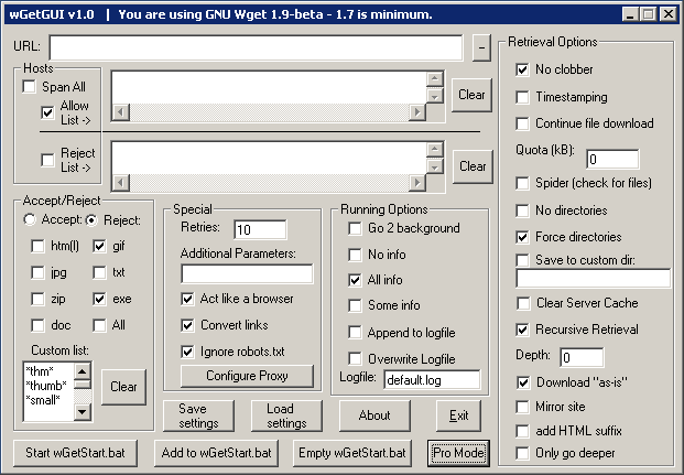
Worst User Interface Ever?
Joseph Cooney found a fantastic example of a confusing user interface. (via Jeff Atwood).
In a comment on Atwood’s blog, Aaron G adds:
The people saying that the UI is good “for people who know wget” are only reinforcing my original point that it provides no useful abstraction to wget and is hence useless as a GUI. If you already “know wget”, why would you want to use a GUI, when clearly the command-line is much faster and less of an eyesore?

Joseph has a list minded at developers on how to avoid ending up with an interface like this:
Here’s my quick checklist of things to look for if you’re trying to avoid create “the dialog“ yourself.
- Strange aspect ratio/portrait aspect ratio (I think portrait just looks odd for dialogs, except maybe property-page style ones)
- Lots of controls (because you’ve allowed too many options)
- controls of same type with differing sizes near eachother
- Non-standard behavior for controls (checkboxes that function as hyperlinks etc)
- non-standard placement of controls
- looks different to every other screen in your application
- options don’t seem very cohesive
- lots of explanation required for options
- you wish you’d just used a property grid, or think you might need to add just one more tab
Joseph Cooney “Developer UI” (via Jeff Atwood “This Is What Happens When You Let Developers Create UI“).
Technorati Tags: usability, ui, user interface, codinghorror, wget

November 5th, 2008 at 20:21 (GMT-1)
Actually, it’s pretty straightforward, just cluttered.
March 27th, 2009 at 14:11 (GMT-1)
Wow. Just one bad UI and you fold up every single developer in it.
April 26th, 2012 at 00:22 (GMT-1)
I was searching for a screenshot of Debabelizer from back in the 90s as an example of the worst interface ever, and what do you know, Jesper already claimed it. Good job, and thanks for the trip down memory lane.