Hidden Functionality — Hints And Affordance
Many of today have extremely advanced features and functionality. But the trend towards simpler, slicker user interfaces points towards hiding some of the functionality. Hiding functionality is — in my point of view — a very good thing for usability.
A usable website (or application) is:
- easy to use
- easy to learn
- hard to make errors in
Jakob Nielsen wrote about how hiding functionality is actually good for usability. The principle is called progressive disclosure, and presumes that you hide stuff that you don’t use often, which makes it easier to find stuff that you use all the time.
Another interesting term is affordance which means “an aspect of an object which makes it obvious how the object is to be used” (definition from the HCI dictionary).
So making functionality scream to the user is one thing. The most frequently used functions on the website must be the easiest to find.
Let’s see some real life examples of how affordances are shown for functionality that is hidden or less discoverable.
Google mail hidden functionality
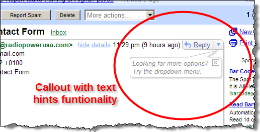
Here, functions to reply, forward, delete, print and more are put in a dropdown (actually an element designed to look like a dropdown).
Amazon.com add tags to a product
Tagging is one of amazons initiatives to add interactive features on the product pages. The interesting part in this context is the little help text below the tagging field.
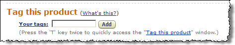
The text hinting the functionality is visually less significant below the tag field:
(press the ‘T’ key twice to quickly access the “tag this product” window)
This opens the tag dialog with “advanced” features as seen below. Note that the primary functionality here is to add one or more tags. That’s actually already accessible from the main page (screenshot above). But to edit existing tags is only available in the dialog (that is if you press ‘T’ twice).
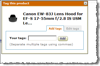
Amazons product page is extremely long ( 6,500 pixels for this product). It can be hard to locate the “tag this product” feature on the page. In this case, users that want to add tags can now easily use that functionality just by pressing ‘T’ twice.
Of course, this requires learning the keyboard shortcuts. But it’s an interesting tradeoff between hiding advanced features, yet making it instantly available to expert users.
Google Personalized Homepage drag and drop
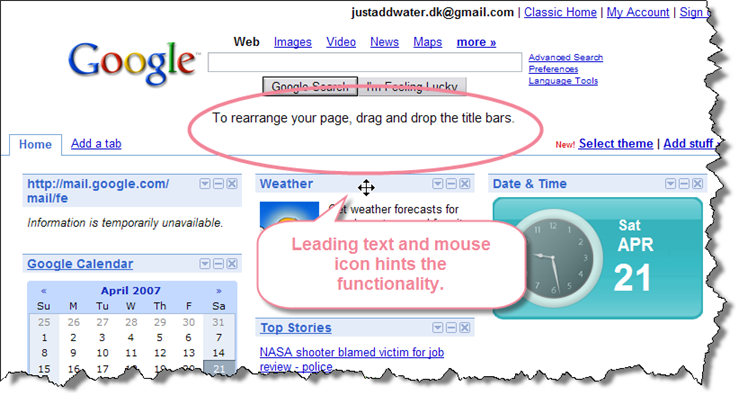
At first visit on the personalized homepage, there is a hint that it’s possible to rearrange the boxes. The screenshot shows the text that is only shown as long as you have not dragged anything. As soon as you have demonstrated that you can use drag and drop, the text hint will disappear.
Google mail autosave
GMail has an example on functionality that is hidden but nevertheless very useful. All emails get autosaved while editing. The only visual indication of the functionality appears after (and during) the autosave:
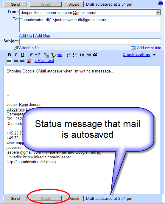
In this situation, there is actually no affordance of the functionality, it just appears. The key to this is to make sure the action is unobtrusive and does not get in the way of the user. Actually, GMail has many examples of hidden actions with no visual clue: CTRL+S saves the text, and I use the shortcut all the time.
Tomorrow, I’ll dig into more examples about affordances of autocomplete text boxes.
More related info:
- Justaddwater.dk: Affordance in autocomplete fields (will be published tomorrow)
- Jakob Nielsen: Progressive Disclosure
- Google search on definition of affordance: Wikipedia:Affordance, HCI dictionary: affordance
- Andy Ruthledge: No instruction necessary part 1 (about affordance)
- Interaction design encyclopedia: Affordances
Technorati Tags: usability, progressive disclosure, affordance, hints, hidden functionality, examples,

May 3rd, 2007 at 16:08 (GMT-1)
As your links indicate, the term “affordance” usually means communicating the function of the object by it’s physical or sensory design, not by tacking some explanatory text beside it. A label on a door saying “Push” is not an affordance. A horizontal bar to press on is. There is a place for brief explanatory text in sites and apps, but such text counteracts the main purpose of hiding functionality –to reduce clutter. True affordances avoid this problem. That said, it’s hard to make compelling affordances in the virtual world of software UI. How do you show the title bars are draggable? One way is to use a “grippy” texture like seen in Java Swing. How do you indicate that the drop down arrow list more menu items? It might help if there were two or three visible menu items, rather than just “Reply.” Seeing “Reply” “Forward” and then the drop down arrow at an equivalent visual level may suggest “more of same here” (assuming users know what the downward pointing triangle usually means).
May 3rd, 2007 at 20:01 (GMT-1)
Great comment Michael. Good that you put focus on “true” affordance as opposed to “just” adding simple text.
However, I think that “true” affordance has some challenges with respect to the most advanced Web2.0 widgets.
A good example is autocomplete text fields that I describe tomorrow. The challenge: It is a text field, it looks like a text field, but it works much differently because of the added functionality (that you cannot see or does not show).
So, in my point of view, “true” affordance for new web widgets will probably take some time and probably also require some explanatory texts before everybody learn :)
May 16th, 2012 at 09:38 (GMT-1)
Hi Jesper! I just wanted to tell you that I really liked your article. I have to admit that I also have a hard time thinking of the term affordance in a broader way (my bad!). Anyway, it reminded me of something that Jared Spool said once: “Viveka insists I’m using the term affordance wrong. Frankly, I don’t care, because it’s the meaning of the term that’s important, not the actual word. So, if you agree with Viveka (and a lot of folks do), feel free to correct me.” from his article “Drag ‘n Drop is Invisible To Users”. :)