Usability work on internal capgemini application
I have recently been working with usability an internal timereporting system in Capgemini.
Due to time and scope limitations, there has been focus on the “low hanging fruit”. Here are some screenshots that I used originally to point out usability issues:
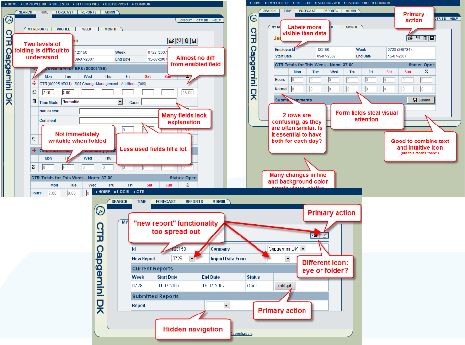
(click on image for large version)
Lessons learned
- Screenshots: Addressing usability issues directly on screenshots is a low-cost, effective way of communicating. Also it gives other team members a tool to show to the superusers/ambassadors, in order to explain the problems.
- Constraints: The usability improvements have suffered from many constraints: Choice of technology, choice of very complex existing data model, lockdown to a very old design that required all action buttons located at a menubar on the top of the screen.
- Legacy design decisions: Not redesigning but trying to keep the pages appear the same is a limitation that made us drop quite a lot of the usability improvements. So it was a shame that it was not possible to convince the project owner to be more free on the design: Fixed width and more focus on the primary actions would have been good.
- Using statistics to underpin our conclusions was very effective. We had stats from 98,000 timereports submitted by 3,500 people in 5 companies in 4 countries. We used these statistics to base some of the conclusions on: Which fields could be hidden by default? How many projects did people usually choose from, etc.
- Behaviour over opinions: The statistics were very effective, focusing the different organizations to work in the same direction: Previous there had been discussion over the theme: “But our organisation /team /project is special”. They stopped because the numbers could prove that some organisations thought all employees did a certain thing always. The numbers could prove that only for instance 30% of the employees had the issue. So we could argue that changing would only benefit 30% and hurt 70%.
There will probably be more improvements in the usability area, but for now, this was what we were able to do with the limited amount of time, resources and wishes for usability improvements that were possible.
Some colleagues and I will work on a new and improved time reporting system user interface that will look perhaps something like this:
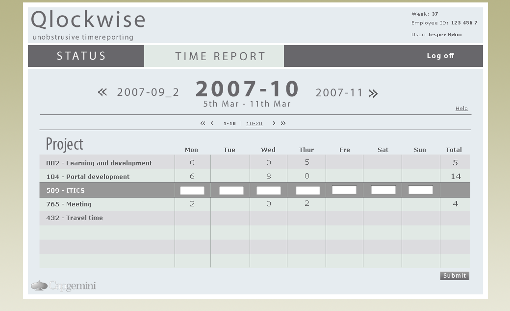
(Design by my co-worker Jonas Moll. Click for large picture)
Some day we may take this design and make a new timereporting interface that’s much more intuitive and faster to use for the typical usecases. Hopefully — and if time permits — we can start this up as an alternative frontend to an existing system, and maybe it can evolve to an easy-to-use state-of-the-art timereporting system.
So small steps in the right direction for a better, more usable world.

November 14th, 2007 at 07:50 (GMT-1)
Hi, nice to see others are doing something similar that we do. I’ve been part of building an internal system for keeping track of consultants’ time too, in a small rails-app of course :)
One minor thing, the first image links to the thumbnail, not a larger version.
November 14th, 2007 at 12:47 (GMT-1)
Both images do :(
(tried removing the “-thumbnail” from the file to no avail)
November 14th, 2007 at 13:04 (GMT-1)
Thanks emil and tracer.
I updated the link so it now points to the larger version.
November 14th, 2007 at 22:36 (GMT-1)
Hi Thomas,
Good to see som effort being put into an often used – and a bit annoying – web application. As an consultant I have been used to time reporting for a long time. I have seen many time reporting systems – including SAP’s (sigh) – and a lot others.
The way I have survived so far is by using the ever familiar tool – the Outlook calendar. I started eight years ago – defined a few simple rules to the appointments and built an interface to the current time reporting system.
Outlook has a simple interface with drag/drop and cut/paste – and we use it anyway to tell the colleagues where you are and to plan meetings.
Why register more than once was my reason to start..
Today I use it to bill my customers, make detailed activity reports and mileage reports. And when every week has passed by, I use it as input to the time reporting system you are currently working on..
November 14th, 2007 at 22:39 (GMT-1)
Sorry Jesper –
I have something with names – i just want to call you Thomas all the time…
April 2nd, 2008 at 18:02 (GMT-1)
Are you implementing Qlockwise? What language? Any possibilities of an open source frontend and db for backend? It could be useful for your testing before integrating old systems…
April 6th, 2008 at 23:16 (GMT-1)
@Simon B.
Right now, we’re not working actively on it. The interface you see above for now exists only as a screenshot, but the issue hereis that we want to apply it for the internal Capgemini time reporting system.
And despite our efforts, there are some technical issues making it extremely hard and non-trivial to implement as a working version (in my view, it only has value if we can actually use it directly for “real” timereporting)
The technical issues were partly solved by our Ruby on Rails plugin “Reform”, read
http://justaddwater.dk/2007/09/11/busy-preparing-railsconf-presentation/
and
http://reform.caplab.dk/
But the legacy timereporting app itself has several issues that makes it hard. Most are mentioned in our RailsConf presentation PDF. Check it out on http://reform.caplab.dk/raw-attachment/wiki/WikiStart/railsconf-2007-mads%2Bjesper-screenscraping%2Breform.pdf
November 3rd, 2009 at 06:25 (GMT-1)
Nice work.
Are you able to change the interface? I see that your post is 2 yr old.