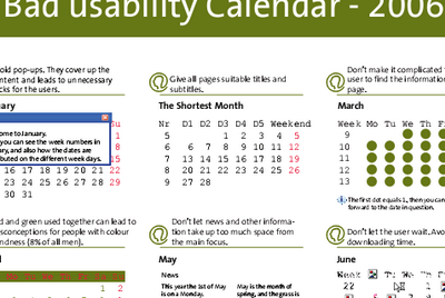
Bad Usability Calendar
Perfect wallpaper for any project room. The Bad Usability Calendar from Norwegian company Netlife Research.
At UI 11 last week I was fortunate to meet Eidar (photo) from Netlife Research. His usability firm made a Bad Usability Calendar, which is absolutely fantastic. I’m putting the link here directly, as their pages are in Norwegian.
- Bad Usability Calendar 2006 (Direct link, English version, 886 kb PDF), [link to page]

They also did a similar calender for 2005, but unfortunately only in Norwegian.
The calendar is an absolutely must-have asset for any future projects. I see several benefits:
- Good humour makes usability easy to understand
- Easy to understand for all project resources
- Visibility of usability in projects
- An actual calendar that can be used for simple scheduling (at least for some of the months that are not completely covered by popup-windows or similar!)
And I will also print a poster to decorate my manager’s wall next to “The importance of User Experience” poster by Frank Spillers. In my opinion the best visual explanation of user experience.
Update 2006-11-10: 2007 calendar is now open for suggestions.
Technorati Tags: usability, accessibility, calendar, anti-usability, user experience, ux, uxp

October 17th, 2006 at 00:33 (GMT-1)
[…] Eine Idee der Norwegischen Firma Netlife Research. Usability-Tipps in Form eines Kalenders. Herunterzuladen als PDF in Englischer Sprache. Keine große Sache, aber nett gemacht. via Jesper Rønn-Jensen […]
October 17th, 2006 at 09:15 (GMT-1)
nice examples of bad design!
October 18th, 2006 at 12:28 (GMT-1)
I’m glad you liked the calendar. We will make a new calendar for next year and it will be available under some sort of creative commons license. Our aim is to share the pitfalls of bad usability with as many as possible. But, be aware if you try to use the calendar in daily life as your work-calendar (as I have) it will have some serious side effects ;-)
October 18th, 2006 at 17:12 (GMT-1)
[…] justaddwater.dk Instant Usability & Web Standards “I would love to change the world, but they won’t give me the source code.” « Bad Usability Calendar […]
October 19th, 2006 at 00:23 (GMT-1)
[…] [via justaddwater] […]
October 19th, 2006 at 22:17 (GMT-1)
[…] [via justaddwater] […]
November 6th, 2006 at 23:19 (GMT-1)
Nice calendar!
November 7th, 2006 at 23:32 (GMT-1)
Bad usability calendar…
Since it is World Usability Day next week (with us of Experientia taking charge of the Italy event), I couldn’t resist posting this hilarious ‘bad usability calendar’.
It was created by the Norwegian usability consultancy Netlife R…
November 9th, 2006 at 12:50 (GMT-1)
Hi Jesper – NetLife Research have started out a global brainstorm for the Bad Usability Calendar 2007 over at our blog. Give us your ideas for next year :)
November 10th, 2006 at 01:20 (GMT-1)
[…] [via justaddwater] […]
November 10th, 2006 at 09:37 (GMT-1)
[…] Our Norwegian friends at Netlife Research have opened for suggestions to next years Bad Usability Calendar. I already used the 2006 calendar with great impact in my professional engagements, and I’m really looking forward to next year’s version. To make a calendar for 2007 that has the same level of unusual unusefulness, we would like your feedback. […]
January 16th, 2007 at 06:36 (GMT-1)
Bad Usability Calendar From Netlife Research…
What a great way to demonstrate 12 key usability concepts – creating a calendar where each concept is demonstrated. You’ve heard the saying – “If you can’t be a good example, be a horrible warning.” Here is that saying manifes…
January 26th, 2007 at 15:12 (GMT-1)
The 2007 version has been released: http://www.iallenkelhet.no/bad-usability-calendar-2007-is-here
Go grab yourself a copy!
January 27th, 2007 at 09:57 (GMT-1)
[…] Bad Usability Calendar (2006) […]
February 9th, 2007 at 10:58 (GMT-1)
[…] Justaddwater.dk: Bad Usability Calendar (2006) […]
February 12th, 2007 at 16:57 (GMT-1)
[…] Justaddwater.dk: Bad Usability Calendar (2006) Jakob Nielsen’s Alertbox for February 12 is now online at: > http://www.useit.com/alertbox/government-nonprofit.html […]
May 3rd, 2007 at 09:03 (GMT-1)
Beautiful demonstration. Let’s hope it reaches enough people :-)
November 18th, 2007 at 17:33 (GMT-1)
[…] Bad Usability Calendar […]
November 29th, 2007 at 11:43 (GMT-1)
[…] Justaddwater.dk: Bad Usability Calendar (2006) […]
March 11th, 2008 at 14:32 (GMT-1)
Nice calendar!
October 23rd, 2008 at 16:03 (GMT-1)
On the following web application, please check out the two-month calendar widget overlay by tabbing to one of the date (depart and return) fields.
http://www.kayak.com/
I’d like to use this type of overlay for the “From:” & “To:” date fields on one of our Web applications but to do so it must be “Section 508 compliant” (i.e., also provide keyboard access to the calendars for mobility impaired users”). Do you know of any applications that have similar Calendar Widget overlays that are 508 Compliant?
Thanks,
George
January 14th, 2010 at 09:01 (GMT-1)
[…] Eine Idee der Norwegischen Firma Netlife Research. Usability-Tipps in Form eines Kalenders. Herunterzuladen als PDF in Englischer Sprache. Keine große Sache, aber nett gemacht. via Jesper Rønn-Jensen […]