UI Conf: Jared Spool
[Jesper’s note: There is actually a lot of this that I decided not to jot down. Jared said that his talk is available on Google Video. However, I couldn’t find it]
Scent of information. Like predator hunting, people hunt for information. The “scent” users pick up is actually trigger words.
Example: A short link from “Neutrogena” link text “SOS” which doesn’t work. It doesn’t contain trigger words.
Try to swap the sitemap for the homepage!
Jareds opinion. Sitemaps actually serve a better job than most homepages do.
[photo of me live-blogging]
Pulldowns and flyouts simply doesn’t work! The trigger words don’t smell.
Example Johnson & Johnson
I couldn’t say that the page would be less dense because it’s already dense. Except for this cute little baby that looks clueless. “I’ve been staring at these dropdowns for months and I still don’t get it
No indication, no clue, no smell. They hide links with trigger words
Hampshire college even worse. There are a list of arrows with absolutely no text. You have to put your mouse over the arrow and it sort of pops out.
Provide the content, or provide the scent
This is the
scrollstoppers
users are happy to scroll
Designers can actually put things into the page that prevent from scrolling
* small text at the bottom
* whitespace at the bottom
* horisontal scrollbar
=> users wont scroll below it
Either the users find what they are looking for, then leave. Or they just continue to read
Q: comment from Daniel Szuc: more aquestion of the priority of the content. How to convice clients to prioritize and perhaps get rid of content that has no strategic value.
A:
“you can’t stop people from sticking beans up their nose”
Best thing you can ask them is afterwards: “is that when you expectes”
[big laugh in the audience]
One way could be to have a clear vision. Then you can ask yourself: is this helping our vision.
Intuitive design
[here are some great examples because Jared picks examples that are used elsewhere as best in class.]
Haynet (used by Jeff Veen).
Two buttons: Need Hay, Have Hay
At first it seems intuitive but it’s not at all. When you look beneath it, there are lot’s of people in the wrong place. And that’s the problem with asking “do you think it’s intuitive?” It just doesn’t work!
Another example: Broadmoor hotel, used as best-in-class example for AJAX interface.
Windows help wizard
Choose between
* minimize database (which by the way is recommended)
* maximize search capabilities
* customize search capabilities
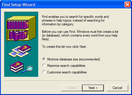
Users have no clue to what to answer at the given time. These are the kind of interfaces that create unintuitive interfaces.
3D manipulation in Word
screenshot where Jared opened every toolbar in word possible.
“I’m so impressed of how small the paper is”
Points out the toolbar for “3D manipulation”.
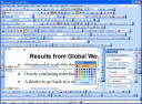
Wants help to close all those darn toolbars. Hello Mr. paperclip.
It looks like you need help. There is a bullet point called “I need help” :)
[Jesper’s note: reminds me of this image from Kathy Sierra’s presentation on RailsConf:]
The knowledge gap
Discussion about Current knowledge point compared to target knowledge
[Jesper’s note: Jared has a podcast from last year on this “what users want“.]
[Also in this podcast (as I remember) description of tool knowledge and domain knowledge.]
Ways to make intuitive
* reduce target knowledge
* as close to current knowledge
* clear clues to increase current knowledge
* without resorting to training or help
Note the last one: Isolated help or training won’t work.
Example book a flight to Spokane, Washington.
Either it goes well, or it goes wrong. No help when things go wrong.
The people that put this into the database are actually designing user experience.
Example: Mail merge
* List of 23 steps (anyone of these can go wrong)
* Change in recent version (?)
Step 1,2,3,4,5,6
Important note: when things don’t go well, or if you will deviate from the default?
The changed wizard is a wizard that works really well.
Context specific help
* just enough knowledge in each step
* it’s a huuuge investment
* probably 2-3 people years to build this wizard?
* is it worth it?
Morale of story: Don’t do a half-ass job with this.
Other examples
* elcomsoft security auditor
* msn money research
* h&r quick tax calculator
Ways to reduce target knowledge
Teaching people things without them knowing that they’re actually learning
* necessary to make design seem intuitive
* has to match user goals
* …
Small additives makes application intuitive. “Exploratory discoverabilities”
How to make design intuitive
* Intuitive is personal to the user
* Based on their current knowledge and the required target knowledge
* Intuitive happens when the gap is minimized
* Just because something seems intuitive to you doesn’t mean it will seem intuitive to your user
* Study your users to discover what is intuitive to them
[My live notes from UI Conf. All UI Conf notes. Expect updates of thes rough notes, with references, images, etc. within the first few days – this footnote will stay, though. Feel free to add comments, links to similar notes, presentations, correct quotes and add where appropriate. thanks! Also I post my pictures on Flickr tagged uiconf]
Technorati Tags: jared spool, uiconf, ui11, scent, trigger words
