New Google layout more usable
After a tip from Ars Technica I found that is was possible to cheat Google into letting you test their new front page design (you can do it too!).
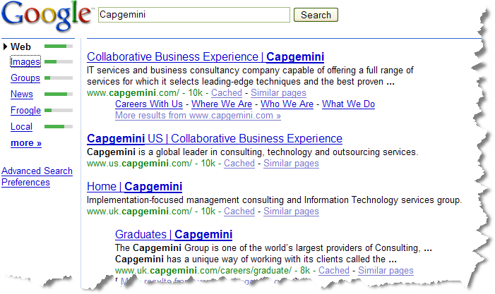
Click on thumbnail to see larger screenshot
As far as I can see the only difference is that they now display their categories (Images, Groups, News etc.) vertically to the left of the search results instead of horizontally above the search field. According to Ars Technica this gives two usability enhancements:
- More search results will be displayed above the fold because their categories now don’t take up the space.
- The user can see a graph next to each category giving a visual representation of how successful the search query was under the given category.
Is this a good improvement? I’ll have to play around with it for a while… but feel free to express your view in a comment :)

March 28th, 2006 at 13:03 (GMT-1)
Google uudistuu?…
…
March 28th, 2006 at 18:42 (GMT-1)
I agree with point 1, but 2 really doesn’t make much sense to me from a usability perspective. Why?
Because then you are giving the user more than one ways to do the task (in this case, it’s searching). This could be good or bad, but when the task is so focused as it is, why distract the user with bars on the left. If the user wanted to look under images, he could/would go there anyways.
And one of the fundamental reasons that Google is popular is because it’s fast, and simple/direct. Now they are changing that with more features and pot-pourri.
March 31st, 2006 at 16:47 (GMT-1)
After I have used it for now 4 days, I must say that it has not helped me in my searching.
The first point with more results being above the fold is of cause correct, but seriously… we are talking maybe 1 or 2 lines of text here – Not something that enhances my overall user experience.
The second point with the graphs helping me to see how successful my query is in other areas (news, images etc.) hasn’t helped one bid either. As Hemanshu pointed out, I would have clicked on “images” anyway if I wanted an image – not because I could see I high match-rate on a graph.
Bottom line is that my eyes tend to look at this new left column before looking at the search results, which in turn takes time from my actual goal which is finding the best result in the main area. And because this new left column isn’t adding any real value I would suggest to Google that it isn’t implemented – or at lest is optional (opt-in).
April 22nd, 2006 at 15:25 (GMT-1)
[…] New Google layout more usable (182 visitors) […]
August 14th, 2006 at 23:10 (GMT-1)
[…] New Google layout more usable […]