Usability Toolkit Now Available
Daniel Szuc tipped me about The Usability Toolkit, now available from Sitepoint.
I just ordered a set, and I’m really looking forward to this, as I remember Daniel mentioned the toolkit when I met him at UI 11 last month.
- Understand usability and get the tools to put it into practice
- Learn the essentials with over 125 pages of usability techniques for evaluating and designing effective web systems, including forms and templates that you can use immediately
- Get on with making your sites usable with more than 200 pages of usability blueprints, offering practical solutions and patterns for blogs, product pages, shopping carts, sitemaps and much more …
- Learn the design techniques that get your users involved
- Dodge the pitfalls before they happen with our 19 pitfall flags
- Discover how to evaluate and test your sites for their usability
- Market usability as part of your service
Daniel recommends the blueprints a useful resource and how these pertain to the patterns discussions.
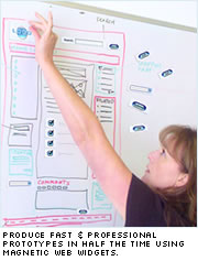
The best part of it — my personal opinion — is probably the early bird free web design fridge magnets. They will fit perfectly in the way we do rapid prototyping with Ruby on Rails at work.

Exciting news!
Technorati Tags: usability toolkit, sitepoint, danielszuc, gerry gaffney, fridge, magnet, blueprints, user interface, ui, web development

November 16th, 2006 at 14:16 (GMT-1)
[…] También lo comenta Jesper Rønn-Jensen en justaddwater.dk […]
March 15th, 2009 at 14:05 (GMT-1)
It seems that the magnetic web widgets is easy to use. I am designing a squeeze page, and it’s quite hard to add content once I’m done with the design. The design somehow gets messed up, I will try this one and see if it will make things easier.