Misleading Error Messages – Litteraly!
We all know that giving the user a correct error message is essential. It is important that the message is clearly visible and written in a way so that there is no doubt what the problem is.
Today I was updating my profile photo on Technorati (the current one was of the little fellow in the top banner of this site, and the new was the same that I use on this blog).
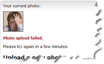
So I went to Account -> Your Photo at Technorati, clicked the “Browse” button, located the photo on my hard drive and clicked “Upload”. But apparently something went wrong and I got the following error message:

As you can see my old photo was still there and the error message read “Photo upload failed. Please try again in a few minutes.”
I then waited and tried again, but with the same result. I finaly gave up.
But suddenly I saw the following on our blog front-page on Technorati:

Hey! This is the new picture – not the old one. But how? Didn’t the error message just tell me otherwise?
In their eager to display error messages in every problematic situation Technorati might have overdone it a bit ;)
Technorati Tags: technorati, error messages, error message, usability, profile, photo, upload

June 20th, 2006 at 21:28 (GMT-1)
In a world of bad og missing error messages, it seems that Technorati practices “better safe than sorry”