Blog Usability: Pogosticking Revisited
Earlier I wrote about Pogosticking and why it should be avoided. I mentioned that pogosticking is: Unnecessary navigation and extra clicks that occurs because pages do not match the information users need to find what they are looking for.
 Then I’m reading this book from 1999. It’s a classic: Web Site Usability (a designer’s guide) by Jared Spool, Tara Scanlon, Will Schroeder, Carolyn Snyder & Terri DeAngelo. Before you read the following excerpt, there’s a few things to bear in mind:
- The book is from 1999 but the research is conducted around 1996-1997 as I understand it.
- The examples are really old school.
- Comparison pages were not invented.
- Verdana was not invented – or at least not used on the web, so the examples here still use Times New Roman as body text.
- The browser used was probably Netscape or IE 3.0 (both released August 1997).
All set? Here’s the book excerpt:
Multiple Comparisons and “Pogo-Sticking”
When users needed to compare several different items — more than three or four — they expressed frustration. We refer to this as a “pogo-stick” problem because users have to hop up and down to get to the information they need. This happens most often when the site’s hierarchy is based on a list of options, usually only in text form. Users jump down to one option, read it, go back up to the list, choose another, jump down, and so on.
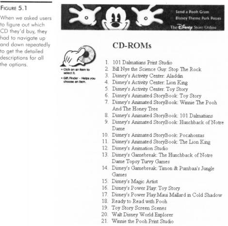
The new Disney site shows this. We asked users to figure out which CD they’d like to buy for their niece. All of the choices were listed on one page as shown in Figure5.1, and users had to navigate up and down repeatedly to get the detailed descriptions for all their options. This even caused one user to give up, saying “Forget this. I’ll just order the catalog.”
We did see users trying to use the browser Forward and Back buttons to help with comparisons, but that strategy didn’t work well either. The Back button took them back to the list of options, and the Forward button took them to the page they had already seen.
Designs That Prevent Pogo-Sticking
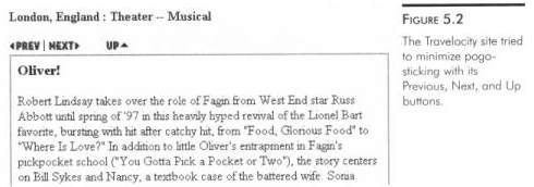
The Travelocity site created lists of options, requiring users to drill down to see each item. Travelocity, however, included Previous and Next buttons to let users move sideways within the list, as shown in Figure 5.2. We thought this would be an effective strategy, and several users did use these buttons.
Similarly, when users went to the car model descriptions on the Edmund’s site, each page had links to similar models, as shown in Figure 5.3. We thought these links might be useful but no one used them, even though we gave users two comparison questions on the site.
The Catalog Approach
The Olympic site used more of a catalog approach, which seemed to frustrate users less. We asked users if there was any Olympic clothing they’d be interested in buying.
The merchandise page of the Olympic site contained thumbnail pictures and brief descriptions of all the clothing, much like a mail-order catalog. Users got enough of an idea about each item to decide whether it was worth investigating further. If it was, they’d drill down and get a larger picture and more detaild description.
This approach is also a pogo-stick construction, but there is enough content in the top-level list of options to let users easily eliminate those choices that are obviously not what they want.
The chapter continues with some 1997 best-in-class examples. HP and WebSaver use questionnares to filter results. It’s stunning that today I’d think twice before using questionnares to narrow down results before any results are shown. In the case of many results, I’d prefer to show some results, and let users decide to narrow down (for instance by searching within results, etc.).
One thing strikes me about the book excerpt here: Even though the finding is ten years old, it is still true. Pogosticking should be avoided and frustrates users. Even though we’ve learned so much from research the last ten years, we still see these errors described here.
For instance, I mentioned Jonathan Boutelle’s single page archive in my previous pogosticking post, which is an important move since most blogging software supports pogosticking out of the box.
The point I’m trying to make here blog software like WordPress, Movable Type and Typo still encourage pogosticking. Blog software makers: Please work with classic usability issues to make blogging easier for everybody!
Read inside the book and purchase from: Amazon.com online reader: Web Site Usability – A Designer’s Guide
Technorati Tags: book, jared spool, tara scanlon, will schroeder, carolyn snyder, terri deangelo, usability, pogosticking, jonathan boutelle, wordpress, movable type, typo, blog, blogging


July 14th, 2006 at 17:37 (GMT-1)
I wouldn’t want to create the impression that pogosticking is inherently wrong. It can be fine in lots of contexts. It’s only bad when it’s used excessively and/or where another option (such contextual navs/links) would be better.
November 14th, 2006 at 14:02 (GMT-1)
[…] Blog usability: Pogosticking revisited […]
September 10th, 2008 at 15:36 (GMT-1)
Yes right, nothing is bad or wrong untill overused. Anything which cross its limit and is over-used either create problems, or bad for all! Anyways, pogosticking is good in lots of contexts.
regards.
September 19th, 2008 at 03:03 (GMT-1)
Hmm, I would have to agree for both sides but mainly as a user. I would prefer not to implement pogosticking because of the frustration to the web user by having to click here and click there over and over.