Pogosticking and why it should be avoided
Pogosticking is best explained with examples:
- On a search results page it would be to go back and forth between the search results.
- In an archive it would be to go back and forth between monthly archive pages to find the right content.
- On a gallery page it would be to go back and forth between the products (usually because the wrong information is available on the gallery page)
In my wording, pogosticking is: Unnecessary navigation and extra clicks that occurs because pages do not match the information users need to find what they are looking for.
Linksys has the following page layout on their support page. I had a Linksys router, and want to find any software updates. I remember that my router is wireless, has 4 cable connections, is blue, the product name is something with “v2” in it. How do I find it?
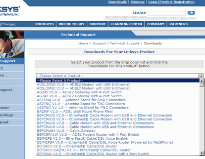
There are 398 products in the dropdown box. My thought here is that their competitors must have a comparative advantage. This is what I found on the similar Netgear support page:
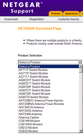
Here are 261 products to choose from.
Jared Spool has posted some findings about pogosticking in “Galleries: The Hardest Working Page on Your Site“.
The Downsides of Pogosticking
When a gallery doesn’t contain the necessary information for the user to decide, they have to resort to ‘pogosticking’. Named after the children’s bouncing toy, pogosticking is when the user jumps up and down in the hierarchy of the site, hoping they’ll eventually hit the content they desire.
Our analysis of user tests shows that pogosticking rarely results in the users finding what they are looking for. In our studies of e-commerce sites, for example, 66% of all purchases happened without any pogosticking at all — the users purchased the first selection they chose from the gallery two-thirds of the time. And when users did pogostick, the more they did so, the less they purchased.
We’ve found this extends to non-e-commerce sites as well: our studies show that users who don’t pogostick find their target content 55% of the time, where as those who do pogostick end up only succeeding 11% of the time.
Also, Jonathan Boutelle has a good point on archive pogosticking (via Jared Spool):
One of the prototypical features of any blog is a monthly archive. This is typically a link on the sidebar for each month since the blog went live, and usually looks something like this:
It’s obviously a good thing to provide access to archived content from the front page. But what use case is being satisfied by this design? Is this really the best way to access archived content?
The casual browser who wants to explore your older content is forced to click on each month in succession, “pogo-sticking” from month to month just to scan your stories for interesting content. Loyal readers looking for a particular article are also forced into the same pattern.
This is a huge waste of time for readers. A much better approach to the archiving problem is to provide one page with hyperlinks to ALL your content, organized by date. This allows your readers to scroll immediately to the article they are looking for, bypassing the annoying “pogo-sticking”.


I previously referred to this in a post about mullet style blog design and long archive pages, and this is actually something we’ll change on this blog.
How to avoid pogosticking
If your pages encourage pogosticking, it’s usually an indication that you have the wrong information on your page. The simple solution is (of course) to work with your content:
- Top page must give users the information that makes it able for them to choose the right sub-page.
- This results in less cumbersome user experience: Users get to the right content right away.
Other info: Ask Jeeves says goodbye to pogosticking
Technorati Tags: usability, jared spool, jonathan boutelle, pogosticking

February 8th, 2006 at 12:07 (GMT-1)
[…] It requires a lot of clicks. Click to edit user #1, back to link page, click to edit user#2, etc. This is so-called “pogosticking“. Extra clicks yields extra time and thus … lower performance (XX todo: usability) […]
June 12th, 2006 at 15:55 (GMT-1)
[…] Earlier I wrote about Pogosticking and why it should be avoided. I mentioned that pogosticking is: Unnecessary navigation and extra clicks that occurs because pages do not match the information users need to find what they are looking for. […]
November 14th, 2006 at 13:00 (GMT-1)
[…] Pogosticking and why it should be avoided […]
November 26th, 2006 at 21:47 (GMT-1)
I’m adding links here to Tales of Pogo Sticks, Bouncy SERPs and Sticky Pages (via Search marketing Gurus).
February 9th, 2007 at 19:35 (GMT-1)
[…] The combination of link plus summary works quite well in guiding users to where they want to go without the need for them to resort to pogosticking. […]
September 3rd, 2008 at 21:49 (GMT-1)
Very good point here! If you have a page selling or presenting a product this is very important to avoid, because visitors might close your window or hit the back button!
September 4th, 2008 at 21:48 (GMT-1)
Good points! It is a waist of time, bandwith and productivity!
November 9th, 2009 at 23:04 (GMT-1)
[…] מאמר קצר על פוגוסטיקינג ואיך אפשר למנוע אותו […]