Mullet Layout: A user-friendly front page
Both Jesper and I have been quite busy working on Capgemini projects the last month + the server move two weeks ago, a new version of WordPress, a skiing vacation and a broken leg took most of my spare time. So the posting-frequency have dropped a little lately. But don’t fear we are still here ;)
Anyway… If you are a frequent reader and take a look at the front page sometimes, you might have noticed that we updated the layout quite a bit. Blogging software like WordPress usually shows the last 10 to 20 posts on the front page in full length. This tends to give a lot of attention to the latest post whereas previous posts quickly move below the fold and away from people’s attention. We quickly changed this default behavior to on only show an excerpt (or teaser if you like). The readers then had to click on the excerpt to read the full story – But this was not enough…
 After reading Jonathan Boutelles “Mullet”-style blog layout article we our self’s started to wonder how to make the user experience better. So this is the first step: Mullet Layout on the front page.
As Jonathan writes the word “mullet” is used to describe the way posts / articles / stories / whatever gets trimmed more and more the longer you look down towards the bottom of the page:
1. At the top of our front page we list the latest 5 articles showing the headline, the excerpt and other relevant links and information:
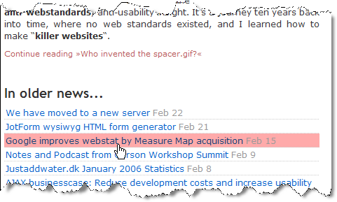
2. Below the teasers of first 5 articles we show headlines along with publishing dates of the previous 35 articles:
It’s pretty neat if you ask me – Simple HTML list with a little CSS magic :)
3. All in the bottom we show a link that will guide the reader to our archives for even older articles:

Related articles
In a couple of related articles we have written about what there can be done to improve the usability of blogs:
- Weblog usability followup
- Blog Usability Improvements
- Blog usability improvements: What we’ll change to make this blog better
We will implement these improvements during the next couple of months and will post about our findings along the way…
UPDATE: I thought that I would add some links to other bloggers that have written about and implemented this new trend:
- Jonathan Boutelles who have also written a series of posts about the Mullet layout
- Kapil Mohan in the post “Mullet” (and here is his code for WordPress)
- Jeroen Coumans in the post “Design and usability updates“


March 17th, 2006 at 10:29 (GMT-1)
Mullet sighting at justaddwater.dk…
JustAddWater has implemented the mullet blog layout, and written an article about it. Here’s his description of the mullet:…
May 11th, 2006 at 17:24 (GMT-1)
[…] I eventually arrived at Mullet Layout: A user-friendly front page and thought it’d be nice if you could just activate a plugin to get the user-friendlier mullet display of posts, instead of switching or modifying themes. […]
May 20th, 2006 at 03:28 (GMT-1)
I am not sure whether I am the first chinese apply this Mullet style plugin. Anyway I like this layout very much bcoz it is consistent with the “shape” of “long tail”.
The ending part of a homepage with a lot of titles shown is just like a long tail. You can have a look how its effect in a chinese blog here:
http://www.g-economy.com
August 14th, 2006 at 23:11 (GMT-1)
[…] Mullet Layout: A user-friendly front page […]
October 4th, 2006 at 07:27 (GMT-1)
it`s cool wp plugins!
thanks!
it is like sitemaps?!
yeah!
March 21st, 2008 at 21:18 (GMT-1)
The teaser posts you mentioned are a great plugin to have for wordpress. They are much more SEO friendly as they prevent duplicate content penalities from occuring (Google likes to see unique content on each page). I think these post excerpts also help to intrigue users to delve into the depths of your website and browse more posts as well–instead of just reading the full posts on the home page and leaving. I have used it personally and I have had great success with the post excerpt plugin.
I had previously never heard of the mullet layout, but this a great add-on. I will have to try that for my other blogs as well! Overall, great post man :)
April 25th, 2008 at 22:21 (GMT-1)
Like the layout, and will implement something similar on my own blog. It’s a good concept to carry across to general site design as well of course.
April 29th, 2008 at 19:34 (GMT-1)
“”business in the front, party in the back” I love that quote. I guess it could be said the same with this wordpress theme.
June 8th, 2008 at 15:30 (GMT-1)
Hey,
Thanks a lot for this plugin.
I’ve been searching for a plugin of this nature near and far this is perfect! Really appreciate your efforts and hope that you would be continuosly developing such great plugins!
And I love the quote – “business in the front, party in the back”
Cheers!
Nadeesha.
http://www.rockfuse.com/blog/
June 14th, 2008 at 06:01 (GMT-1)
Great plugin review I will be attemping to install it tonight
July 16th, 2008 at 02:21 (GMT-1)
I was just searching through your blog and I like the looks of it. I think I should try this plug-in on mine. I have been looking for something different.
Does the SEO on this type of blog improve your serp rankings?
July 24th, 2008 at 05:28 (GMT-1)
What an interesting plug-in. I think I will try it on my blog. I am getting more experience at blogging and always looking for ways to improve. You have a great way of explaining things.
July 28th, 2008 at 16:23 (GMT-1)
Looks great! I will download the plug in and try it out. I have been trying out plugins to cut the post or show an excerpt on the front page but some break the layout when there is a picture and some don’t show the picture at all. I will check this one out! Thanks!
August 11th, 2008 at 17:14 (GMT-1)
People must always remember that they make a website for the visitor who is actual human! So always build your front page as humanly friendly as possible. I very much agree on that.
August 31st, 2008 at 13:57 (GMT-1)
Cool layout! Thanks for sharing this! Thanks for the link, i will be trying to implement this!
September 9th, 2008 at 14:14 (GMT-1)
WordPress is going better and better in these days and am wondering why they are so late to do so. on the other hand I have been reading a blog entry which explained that how we can change a wordpress blog to a Digg style site. I think it is much better to use plug-ins with wordpress to do that insteas of those dirty clones.
October 12th, 2008 at 15:39 (GMT-1)
I’ve been mulling over front page layouts recently. My usual philosophy is ‘keep it simple’ and the mullet idea fits really well with that.
I think the future is to present different front pages to different users. Show your latest posts to regular readers and a ‘must read’ selection for first time visitors.
October 21st, 2008 at 18:57 (GMT-1)
Man I like this mullet add-on, very user friendly for the front page, I will definitely be installing it on some of my blogs.
November 29th, 2008 at 07:26 (GMT-1)
This is an awesome little feature for WordPress. That’s one thing that I don’t like about Blogger blogs. They often don’t have the cool little things that make WordPress cool.
Have you tested out Drupal by any chance? I heard that it’s supposed to be a pretty good program.
January 19th, 2009 at 08:16 (GMT-1)
I like that you lay out your thought process. I may be using the mullet layout…but the way I achieve it, I think, is by using the more tag. That compresses the posts and allows them to show more of the posts on the main index page.
January 25th, 2009 at 01:03 (GMT-1)
Wish it didn’t remind of the mullet haircut. I do think this is an awesome feature to add to my WordPress site. I really prefer the snippets over long post descriptions that few people read anyway.
October 31st, 2009 at 23:36 (GMT-1)
Is there anything similar available for Drupal?