How To Align Labels On Form Fields
Form usability revisited. In case you missed it, Luke Wroblewski (principal designer of Yahoo!), has made a thorough presentation on best practices in form design. The entire 112 page presentation is definitely worth a read. Kind of required read in my work :)
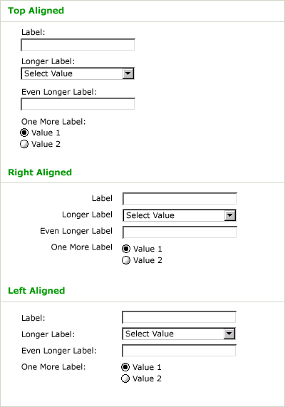
Here is why to prefer top-aligned labels:
Top-aligned labels tend to reduce completion times (how long it takes to complete a form) the most for familiar data (i.e. address, credit card, etc.) because they only require a single eye fixation to take in both input label & field. Top-aligned labels also work well for forms that require localization or long labels as there is plenty of horizontal real estate to expand/contract the label without negatively impacting the overall page layout. Top-aligned labels, however, do take up a lot of vertical real estate.
(Luke Wroblewski: Top, Right or Left Aligned Form Labels)
The report also has eye-tracking data to back it up:
I’m working hard to memorize all his great points that can help me as inspiration for better interaction design.
Read more and download the full report from his article “IA Summit: Best Practices in Form Design” (Luke Wroblewski, March 26, 2007)
Technorati Tags: interaction design, ixd, usability, eye-tracking, form, design, webdevelopment, lukew, yahoo, best practice


April 20th, 2007 at 23:24 (GMT-1)
I have been having a some success with a different kind of layout – one where the label is inside the form field.
I have used this layout for almost all my latest projects, and it seems, to me atleast, that it partly eliminates the problem of eye-fixation (people do not need to mentally connect a label with a form field).
One example of this is here:
http://www.baekdal.com/web2rss/
Note: I am not inventer of this concept, I just use it.
April 24th, 2007 at 11:54 (GMT-1)
It would be nice to have eye-tracking data for bottom aligned labels as well, like those which are used in Wufoo forms.
@Thomas: your idea looks very good and it seems to be working very well for small forms. Obviously, the extended border aids they eye to match the label with the corresponding input. I was wondering if you have tried it with larger forms or with radio button groups as well…
April 24th, 2007 at 21:31 (GMT-1)
Iacovos, If you click on “show advanced setting” in the WEB2RSS example, you can how I handle checkboxes.
and yes, I have tried with larger forms. It works quite well for mest things. The only problem is handling textareas because some tend to get confused about where the text “area” in the expanded field is.