Usability of Pagination Links
In case you missed the thorough pagination gallery that was published in November: Pagination Gallery: Examples And Good Practices
There are really some good (and bad) examples collected at the page, including these written “best practices”:
- Provide large clickable areas
- Don’t use underlines
- Identify the current page
- Space out page links
- Provide Previous and Next links
- Use First and Last links (where applicable)
- Put First and Last links on the outside
I am missing a few important points in that article.
Think twice before adding link to “last”
First, i will in some cases disagree with the advice to use a “last” link as mentioned in #6. For big search results it will mostly be irrellevant to jump to the last page. Often a search resulting in lots’ of hits will lead to another more specific search. Who cares what the last of 24,000,000 results on a Google search for “usability”? I think it’s correct of Google not to show a “last” link. Jakob Nielsen notes that 42% use the top link, 8% the second link, and the other links are even less likely to get attention. (see end note for details).
The anatomy of searching is usually to keep narrowing your search until the result you were looking for is in the first page.
Also Amazon uses that technique. Here is a screenshot from the German Amazon.de:
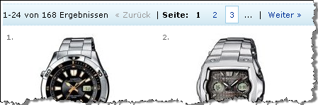
As you see, there the paging only covers the first 3 pages (or 75 items of 168 found in the query). In my opinion (and backed by the Google and Amazon examples), this should be the default. However, in rare cases there could be an idea in providing a “last” link.
For instance in a netbank, when searching for payments or elsewhere when returning a limited, known resultset you are likely not to narrow down further.
So I would reformulate #6
6. Use First and Last links (where applicable)6. Provide a link back to first page. Don’t use a link to last page, unless there really is a value for the end user on the last result page.
Number of pagination links
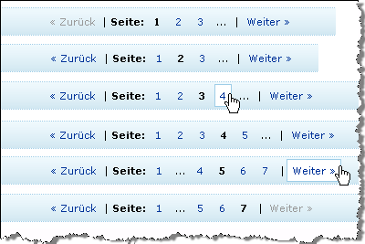
Also I am missing a guideline regarding to how many pagination numbers to show. Here is my suggestion:
8. Provide a reasonable number of pagination links. Usually, the 3 first pages are enough.
The last sentence follows the Amazon example from above. For the record, i have gathered the different states here in case i am missing something
Consider “endless” scroll and avoid pagination
One other point that I want to add is that pagination add a lot of controls that don’t necessarily add value to your content. By adding more links, the content gradually gets hidden more and more. In article, there are som example where pages actually implement so many paging controls that it will eventually confuse some people. So, before adding pagination, consider the alternatives.
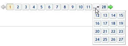
For instance, does it really, really add value that you are able to jump directly to any of the 28 pages in this example:
One alternative is the “endless scroll” model. Bill Scott originally wrote about this and implemented it for Rico (javascript framework). Bill’s Death to Paging! – Rico LiveGrid Released
Currently, Google Reader also uses this, and it’s very intuitively implemented. You scroll the feed list and when the scrollbar approaches the bottom, suddently, more items are loaded in the background.
Important pros and cons of “endless scroll”:
- Very intuitive. No need to learn new navigation, just scroll.
- No need to clutter interface with additional controls that require braincycles to understand
- Watch out: Can be surprising to new users that the scrollbar itself shrinks as new results are loaded
Because of the last bullet, I would not recommend using “endless scroll” in any situation. But at least I would recommend you seriously consider it. (Btw, if you know of any other easy-to-implement of endless scroll, please let me know and I’ll add it to the article).
Alternative: No pagination
One final option also deserves a mention here. Using no pagination, “endless scroll” or similar is actually the easiest to implement and the easiest to comprehend.
Actually, we recently decided not to implement pagination in a project. Instead we took a principal decision and showed maximum 30 results. The question “what if there are 31 results?” — the classic N+1 question that you would have to face regardless of you pagination strategy or a fixed number of results.
The biggest advantage of this is that it’s the fastest to implement. Just limit the number of search results to a fixed number. But this also puts a burden on you shoulders: You as the application designer must make an informed decision about how many results it would be appropriate to show. In the case of a Google-like search dataset, there are data that suggest that most people choose from the first 10 search results (or else they narrow searching). So 10 results may be appropriate. In other cases you may want to adjust that number to either side.
In any case, make sure you ask your project team the question: Did you seriously consider no pagination? Seriously? Are there features we should spend time on that add more value than pagination?
Making informed design decisions on behalf of the users is one of the things I admire in “getting real” by 37Signals. If anything can be done to reduce the number of braincycles used to understand a user interface, make sure you seriously consider it. Start With No [pagination]. Epicenter Design [to focus on the most important features]. Build less. Beware the bloat monster.
End note:
Jakob Nielsen: “The power of default values” (September 2005), Thorsten Joachims et al.: Accurately Interpreting Clickthrough Data as Implicit Feedback“(178KB pdf file). Nielsen notes that 8% follow link number 2, but I can’t find that result in the publication. This graph I’m reading as follows:
![]()
- 42%
- 16%
- 12%
- 6%
- 5%
- 7%
- 3%
- 4%
- 1%
- 4%
Regardless of the accurate numbers, it does not alter the conclusions that users focus on first results. Furthermore, there is nothing in the materials that backs up my theory that people narrow their search until what they look for are in the top results. Please let me know if you are aware of any numbers that can confirm that.
Technorati Tags: usability, pagination, livegrid, rico, amazon, google, getting real, 37signals

January 3rd, 2008 at 15:46 (GMT-1)
I guess it will mostly make sense to supply links to the end/all pages, if you have a result set that is sorted — eg. alphabetically or by date. And even then, you would probably also supply an option to reverse the sorting or narrow the result set.
One thing I miss in the applications I have encountered that uses endless scroll, is a (better) indication that more data is being loaded when you reach the ‘bottom’. While Google Reader does show a message with ‘Loading more items…’ it’s hard to notice.
January 3rd, 2008 at 16:12 (GMT-1)
Hi Jesper, like your Blog and I agree with your post. Just one thing for your non-german speaking readers: “zurück” and “weiter” mean “backward” and “forward” and function like one-step-backward/forward. They don’t mean “start/end” or something… :)
January 3rd, 2008 at 21:56 (GMT-1)
I agree with Tobias: being able to reverse the sort order is critical, and replaces the need for a Last button. Nice post.
January 3rd, 2008 at 22:05 (GMT-1)
Need to qualify: my comment above doesn’t apply to Google results (or any other search by relevancy). Price, quantity on hand, age, size, alpha: those all need a reverse sort.
January 4th, 2008 at 09:42 (GMT-1)
@Tobias and @Geoff: I agree with you that the ability to reverse sort can be important. But my point is, that you really shouldn’t consider adding a “Last” link unless you are in that situation.
But note that “reverse order” will suddenly add even more controls to the pagination. The flaw about that is that more controls will grab attention away from the stuff that acts value on the page. (this is a classical issue that I regularly encounter in advanced searches… for instance Danish book stores and libraries).
My advice here is that you have to be careful with how many controls you add. Because controls to less important features are irrelevant. The primary focus is on the data. Maybe you forget (as the designer of the page) to focus on the most important job:
Prioritize content. Ask for instance:
And as Geoff mentions, this does not go for generic search results that are sorted by relevance.
To be a little controversial: If you have to sort by relevancy, ask yourself which other controls you can remove? The pagination, perhaps?
January 4th, 2008 at 14:29 (GMT-1)
[…] usability of pagination links: Jesper Rønn-Jensen’s annotations. Consider “endless” scroll and avoid […]
January 7th, 2008 at 11:16 (GMT-1)
Don’t use underlines ????????
but why?
January 7th, 2008 at 11:26 (GMT-1)
@Joe
I understand why you frown at that guideline. I think it’s important that pagination is always secondary functionality compared to the actual content.
Yes, normally underlines indicate that there is content or functionality behind a given text and it’s convenient that you don’t have to discover by moving your mouse around on the screen.
But I would argue — the same way with menus — that this is secondary functionality. If you don’t instantly discover the pagination, so what! The default sorting of the paginated list should be good enough for most people.
I would personally prefer that the actual content steal attention — not subsidiary links etc. Of course, it’s a tradeoff, and it depends on your actual data. But in general I think you sould
Turn this around: You would never start with pagination links that are visual dominant for the content on the page. That would signal that you are on the wrong page.
January 14th, 2008 at 14:48 (GMT-1)
[…] Usability of Pagination Links […]
January 20th, 2008 at 17:21 (GMT-1)
You may want to look at http://unspace.ca/discover/pageless
January 20th, 2008 at 20:54 (GMT-1)
Looking at it from a google point of view…. Showing more that 3 or 4 on a “text-based” search would seem redundant. However, the image search is something that no mathematics “easily” can decipher relevancy to. There it comes quite handy to have many pages. Adding more keywords to an image search might just loose the result you were going for.
In both cases last results is unnecessary. I also agree wit not showing more than 1, 2, … next >> If you are doing a generic search then page 15 (for example) won’t be much of use. As a layout designer.. i believe that bringing content to a user is much more valuable that making them go look for it.
January 21st, 2008 at 16:17 (GMT-1)
Great article. I do agree with not using the “last” link, it could finish up confusing users.
February 29th, 2008 at 13:35 (GMT-1)
[…] justaddwater.dk | Usability of Pagination Links (tags: pagination) […]
April 18th, 2008 at 09:00 (GMT-1)
Using incrementally increasing numbers is also a Yahoo recommended design pattern. E.g.
1, 2, 3, 4, 5, 10, 20, 30 , 100
Also, although not considered pagination directly, have an option to decide how many results per page to show makes life a lot easier.
Joe, because: it is hard to read, it is assumed (in this rare case), and everyone is doing it. Do you need another reason?
P.S. I wish Google would still let me look at result 20,000. I am so nerdy that way sometimes that I want to see the last result when I get tired of the top 100 results.
10 Top Reasons Why Jakob Nielsen’s USEIT.COM is NOT usable, nor intuitive
April 29th, 2008 at 14:31 (GMT-1)
I know this all about human usability but there are other reasons to put last and/or more than 3 links.
I’m referring to SEO considerations.
On indexing pages of all sorts (not search results pages) it is sometimes important to make it easy for spiders too to get to as many pages as possible so that they can be indexed.
June 10th, 2008 at 18:00 (GMT-1)
“endless” scroll may be best option and look nice, I must use this in my next web project.
Use more that 3 links like tell hagoleshet can be useful to help search spiders but actually think that for this is better and more important add the site to webmaster tools in searches.
June 20th, 2008 at 21:41 (GMT-1)
An excellent post, and one that many will have an opinion on. I suppose it comes down to what works best on your own site, rather than on others, and that means either split testing different methods, or testing each over a period of 2-3 months. On some of my sites 1,2,3 is is good enough, but on the forums I need to list to at least 6, and this has proven itself over the years with feedback.
June 22nd, 2008 at 08:03 (GMT-1)
Great article!
Congratulations Jesper!
October 8th, 2008 at 17:19 (GMT-1)
Really an useful post, now and thanks to this I plain better my site structure and I made a few days ago an experiment with different possibilities, one using “endless scroll” and other with pagination links. In a few weeks I will see results and comment here. Thanks for share.
December 19th, 2008 at 05:32 (GMT-1)
That graph is very accurate compared to the way that I search for things also, if I cant find what I am searching for within the first ten results I will change up my wording for a new search. Images is a whole different thing though I will browse through search results forever until I find what I am looking for.
January 1st, 2009 at 12:24 (GMT-1)
[…] justaddwater.dk | Usability of Pagination Links (tags: pagination) […]
January 19th, 2009 at 17:57 (GMT-1)
The sad thing is how this very good practices (for the web) have been migrated in to enterprise systems, for example, think of an inventory system for a state government, let say they have around 500,000 different things in inventory, and you search for anything that begins with “a”, the result is going to be around 50,000… what is the advantage of pagination here? do we seriously thing that the user is going to spend 3 days reading page by page until he founds what he is looking for?
I think pagination is one of those overused stuff that migrated from system that work with un-structured data (like Google) an in to systems that work with structured data (based on RDBMS) and that really do not make sense in the structured world, if you are getting more search result than you can read in under 1 o 2 minutes that that pretty much means that your search is not specific enough. Why bother implementing pagination then?. It seems to be a psychological thing we, as developers “like” the idea of offering “freedom” to the user, and the user likes that “freedom”, if you remove the paginator they will complain because they do not see it, even if they always find the search results after the first page useless.
February 25th, 2009 at 01:31 (GMT-1)
I think there should be a limit to this endless scroll idea. I love long pages, not having to click to the next page, but there should be a cap. It’s freaking annoying to use a little scrollbar, being so sensitive. Therefore, I support Google’s preference option to list 100 search results. It’s much easier for me to find what I want if I have more options up front. Clicking to different pages of listings just discourages me.
April 14th, 2009 at 11:33 (GMT-1)
[…] For a more thorough discussion on pagination and pagination patterns see http://justaddwater.dk/2008/01/03/usability-of-pagination-links/ […]
May 18th, 2009 at 15:20 (GMT-1)
I agree to the reformulate #6. And that is also right users always focus on first results. But I doubt that the theory that people narrow their search until what they look for are in the top results. Actually the hypothesis are based on the premise that all user are search engine savvy and the serps always are the best possible results. I am afraid both are not sufficient enough. It is not so user-friendly way if treating users as robots. Googlebot can not replace human being when it comes to intuiton. Sometimes I search for somthing and use all keywords I could think of, but the top serps just did not show what I need. So I have to browse them page by page. I know this is crazy but I have no idea what else I can do at all.
March 18th, 2010 at 12:44 (GMT-1)
What often annoys me in this context, is the limit how many products (or search engine results) will be displayed on one page.
I clearly prefer one long page I can scroll through instead of using pagination. With on page I am able to search through the whole page for words I am lokking for, for example (text search). Furthermore I can visually scroll thorugh product lists and get an idea if there is something for me quickly.
Best wishes,
claude
January 20th, 2011 at 07:23 (GMT-1)
[…] Usability of Pagination Links – Jesper Rønn-Jensen Pagination Gallery: Examples And Good Practices – Smashing Magazine In search of the ultimate pagination – wolfslittlestore Infinite Scrolling Best Practices – UX Movement Über den Autor: Manuel Ressel ist Conversion Designer bei der Web Arts AG. Seine Leidenschaft gilt dem Thema der Emotionalisierung von Kauf-Prozessen in E-Commerce-Portalen. Folgen Sie ihm auf Twitter oder besuchen Sie seinen Blog Conversion Design. […]
March 4th, 2011 at 17:06 (GMT-1)
[…] is dan wel handiger dan weer door die 159 resultaten scrollen… Hoe je je resultaten op een gebruiksvriendelijke manier pagineert, is weer een verhaal apart…Wat te kiezen?Uit bovenstaande blijkt dat er wel redenen […]
November 10th, 2011 at 19:33 (GMT-1)
Do you have any recommendation or usability research around making the pagination left-, center-, or right-justified? Google, Yahoo, and Hulu all do it differently. Is one more usable than the other?