Usability of Map With Positions in CSS
These days I’m working on the HTML and CSS for this map, but I want to hear your opinions as what to recommend from a usability point of view:
- The top map where the cities are placed on the map directly (it’s a HTML list)
- The bottom map where the list is to the right of the map, but each city name contains a reference placed on the correct position on the map.
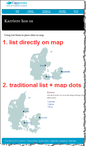
Click image for link to working example: map-example-denmark-v002.html (version 001)
(also available as zip file with included graphics: map-example-dk-v002.zip)
I am thinking that some people want to find on a map, while others are better off with the list. As for webstandards, it’s a requirement for me that I keep this without JavaScript and in clean valid markup. It must work and look good in IE6, IE7 and Firefox 2.
Both examples use standard HTML and CSS.
One annoying bug for the lower example in IE6: When hovering the cities on the map, the footer jumps up and covers the map halfway up.
I really would appreciate any suggestions or opinions. Both regarding the usability and the actual code implementation. Which of the map versions do you like the most, and why?
PS. I am aware that IE6 does not show png images correctly and will add pngfix later into the process. For this example, though I figured you would not need it to give me your opinion :)
Technorati Tags: html, code, webstandards, css, map, positioning

December 21st, 2007 at 09:46 (GMT-1)
The use case for your map may be different but, in the user testing of the swedish government portal sverige.se they found that a combination of map and list was required. Some users preferred clicking on the map, others liked the text based list approach.
I guess it comes down to if you are looking for a specific city to work in. Is tha map needed at all then? How many cities will the list/map contain? Is the location of the cities common knowledge for the users?
December 21st, 2007 at 10:18 (GMT-1)
Thanks for the input, Peter.
In this case, there will be a maximum of 10 offices (the number of Capgemini offices in Sweden).
The list you link to “sverige.se is good inspiration. As a foreigner, though, it lacks important information. As the list on sverige.se is “either/or”, i can not learn anything from it.
As a foreigner I have no idea where for instance Jämtlands Län is.
When I look at a list like that, i want to learn about where each area is on the map. And that is why I wanted to try version number 2 on this page.
That way, somebody might be able to learn more about data — or at least connect the map with the list.
December 21st, 2007 at 10:52 (GMT-1)
Comment from a user, not usability specialist:)
The 2nd map is much better – I can hover over the list navigation and learn about location instantly. The 1st map offers me clickable locations, but then I have to “travel” with my mouse.
I also agree with Jesper’s point about foreigners – or about people that do not necessary know geography that well:) – the map and locations visualized are priceless – it gives you quick information that you can confront with your job expectations. The list itself won’t do.
All in all: combination of the map and list navigation gets my vote:)
December 21st, 2007 at 10:53 (GMT-1)
I just found cause of IE6 bug: It’s the Guillotine bug.
My fix: To wrap the elements next to the floated image into an element with the “holly hack” applied (height: 1%; to force hasLayout).
CSS:
.reca-map-w-hover-offices-container {
height: 1%; /* fixes IE6 guillotine bug */
}
HTML:
<div class="reca-map-w-hover-offices-container">
  <h3>...</h3>
  <ul>
    <li>...</li>
  </ul>
</div>
I will update the example pages later today
December 21st, 2007 at 16:04 (GMT-1)
Krantz is right –the best for usability depends on the task and user. What is this page used for? How geographically knowledgeable are your users? For example, are users looking for a convenient location to visit from their Danish home? Can the vast majority of your users locate their home on a national map? Here in the geographically-challenged US, I’d bet there is a substantial population of US web users that can’t.
If your users know their location on the map and are trying to get to the closest office, the map alone is best. Consider adding some major geographic references to the map as non-links to aid the user in locating his/her current location.
If users are trying to get to the closest office, but many can’t use a map effectively, then include the list in addition to the map. For a list of 10 items, organize and label the list into 3 or 4 major geographic references. For example, Gentofte could be listed under “Copenhagen Area.”
If users have been given a specific city name to get information about an office there, you don’t need a map at all, but just an alphabetical list of cities.
December 28th, 2007 at 07:51 (GMT-1)
As has been stated it is important to understand the users intent with this map. That said I think the second map is probably preferrable. Though I’d suggest two changes:
1. When mousing over the map location the yellow mouse over in the list is distracting to the eye. It pulls my focus over to the list, but I’m trying to use the map. I’d just match the bold mouse over done on the map.
2. The listing of cities next to the map needs to be labeled such that the user will understand this is a duplicate list of the cities shown on the map. Also the cities didn’t seem to be in alphabetical order…though this point maybe due to my not understanding Danish (I assuming).
June 22nd, 2008 at 07:58 (GMT-1)
I think too that the best for usability depends on the task and user, but it very useful to me and i already applied the example.
Thank you!