Amazon Redesign Coming Up
On some computers, Amazon are preparing for the final steps of rolling out their new redesign… Just in time for Christmas shopping.
(click to see full length screenshot)
Amazon is often called the most intensely tested website in the world. Much of the design decisions and prioritations of content are based on automatic algorithms. So many (smal) changes have been made during the years.
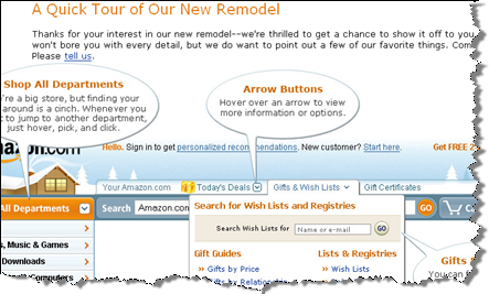
But this time, Amazon apparently decided that it was necessary with pages to tell what changed. One thing in particular that I like from the page:
But I liked Amazon the way it was! I really dug [insert your favorite feature here].
Don’t worry–we didn’t remove anything. All your favorite features are still here. If you have any difficulty finding anything, please let us know. A few of you have already written in and asked about the following:
Bestsellers: Look for the “Amazon Bestsellers” link under “Amazon Exclusives” in the Features & Services box on the left-hand side of the Amazon homepage. You can also find bestsellers (or top sellers) for each department under the search bar in that department.
E-cards: Find free e-cards under the search bar in the Gifts store. To get to the Gifts store, just click on the “Gifts & Wish Lists” link above the Search box on any page.
International websites: The easiest way to navigate to our international sites is to scroll all the way down to the bottom of any page. There you will see links for our other sites.
Your Seller Account: Click on Your Account above the Cart button. On Your Account page, click on the “Your Seller Account” link found on the right-hand side of the page underneath the Cart button.
Source: http://www.amazon.com/gp/events/gno/103-8005038-4005464
So here is a school example on how to get the feedback out back to the audience.
I would like to know more about this redesign:
- How big a percentage is getting the redesigned version?
- How many of the visitors actually go to the “quick tour” page I show above?
Learn more at http://www.amazon.com/gp/events/gno/103-8005038-4005464
Technorati Tags: amazon, redesign, quick tour, usability, testing


November 7th, 2007 at 14:12 (GMT-1)
Interestingly (even though it’s not had the big interface update) the UK site has a different Christmas logo to the USA site:
http://www.amazon.com
http://www.amazon.co.uk
apparently the UK enjoys lanterns hanging under the rafters of its wooden chalets!
November 8th, 2007 at 01:40 (GMT-1)
I am not that excited by the new design – There are too many things, and not enough focus.
What have happened – I think – is that they have listended too much to their powerusers (which are also most likely to provide feedback). The big problem with this group is that their usage patterns is very different from regular people who just wants to buy something.
Powerusers trades control for simplicity. They would rather have drop-out menu’s and other doo-hickeys, than simple pages that guides you to the content. Regular people wants just the opposite, they would rather have simple choices than control.
They seem to try to combine the two by adding a ton of visual effects. All in the best intentions I am sure, but it really prevents the natural “flow” of the site.
November 9th, 2007 at 03:19 (GMT-1)
Amazon is one the most ugliest websites around, lets hope the new designs will make it more prettier
November 17th, 2007 at 02:54 (GMT-1)
Horrible design – many rounded corners, loads too slow, too many ads on homepage, missing H1, H2 tags. They’re crucial for the SEO. Amazon is not accessible, almost all of the images have no “alt” attribute, where others have … empty “” value. Not good, pretty embarrassing actually. Amazon can not be visible to the blind.
April 2nd, 2008 at 17:58 (GMT-1)
I tried ordering Defensive Web Design through amazon, but ended up writing angry emails to them to get my account closed. I’d prefer not to deal with them again.
Main problems: too many cluttered screens, wasting my and their time getting from “book page” to “price+shipping to my pre-set 1-click adress”. Most of my 1-click order tried took several pages, and ended with “Sorry, can’t ship to Europe. Now we’ll force you to click a small Delete button before you can get on with trying another one.”
December 8th, 2008 at 14:24 (GMT-1)
I cant recomend ‘Dont make me think’ highly enough. It’s a brilliant read and really gets down to the nitty gritty of the web.
December 13th, 2010 at 10:57 (GMT-1)
Hi Guys,
Got a story you might be interested in. It’s about the current state of Amazon.com’s usability for international buyers, and a proposed redesign for their product pages. I won’t waffle on so please take a look at the source if you’re interested:
Redesign:
http://www.kintek.com.au/demo/amazon/index.html
Source:
http://www.kintek.com.au/web-design-blog/amazons-terrible-international-usability-and-a-proposed-redesign/
Regards,
Maurice Kindermann