Attending Reboot Conference
May 31st and June 1st, the annual Reboot conference will take place here in Copenhagen.
For now, there is no information on who’s speaking and almost no rumours on what’s going on.
But I’m expecting the best: Usually, there is a strong setup of international speakers on topics that range from geek speak to the more managerial level. Last year was a blast, and I hope for the most interesting presentations.
However, just networking and meeting old friends and colleagues and perhaps potential business relations, is what I look forward to the most :)
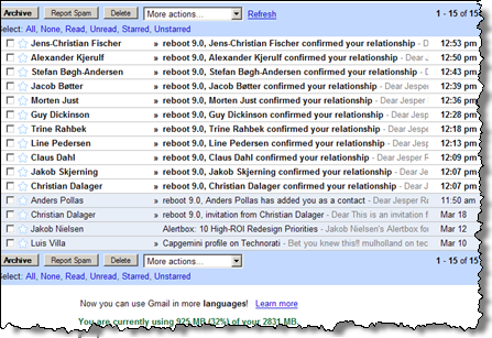
Like Jakob “mentalized” Skjerning, I must agree that the website is absolutely horrific. And after registering relations to other participants, I was “spammed” by auto generated emails each time I’m involved in a new relation:

See you soon!
More info
- Reboot website
- Jakob Skjerning: “reboot 9.0 is coming“
- Justaddwater.dk: “reboot8 roundup“
Technorati Tags: event, conference, reboot, copenhagen, denmark, reboot9

March 23rd, 2007 at 10:02 (GMT-1)
Hey Jesper,
Good to hear you’ll be there as well. I can’t wait to meet all the great people again and have a nice tall Tilburg (and others :-) ). See you there!
March 28th, 2007 at 23:55 (GMT-1)
Katharina Birkenbach wrote me to know more about my comment on the design of reboot.dk (she works on the site):
My answer:
Hi Katharina.
my apologies for the late answer… Things are really busy for me at the moment. I’m glad you sent a note. Here are a few quick things that I find that affects the user experience in the wrong way:
* friends list are hard to scan. The relations are put horisontally a long list. Example: http://www.reboot.dk/module/Contact/list/public?id=1028
Consider making the lists vertical — there’s plenty of space for it.
* Typhography: Contacts in capital letters make them hard to read. In my opinion, the text is generally a size too small, making it harder for me to read.
The italics on the proposals page (http://www.reboot.dk/listpublish-111-en.html) are also hard to read, and high contrast background photos make it worse.
* the lightboxes: Nice idea, but two small things annoy me: the background-overlay is not dark enough. Consider making it darker to make it instantly obvious what is foreground and what is background. The other small thing in the lightbox for making relationship: The radiobuttons should use the
Having said that, don’t take my blog post as criticism for your work. I know that it’s really hard work to get a site with this functionality up and running. Hope you can use these thoughts that I had in mind when writing that note in the blog post.
Besides, If you don’t mind, I’ll post this reply and your questions in the comment track for the blog post.
I’m looking forward to meet you at Reboot:)