The Quick Way to Creating Disabled State Icon With Photoshop
For an internal demo, I had to make my own disabled and :hover states of some buttons.
In Photoshop (Elements) it was dead easy by adjusting the color in each layer.
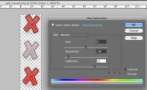
I found that the following settings worked very well:
In Photoshop, create a new layer for each button state. Select the layer and choose “Enhance” > “Adjust Color” > “Hue/Saturation”
Disabled state background-image:
- Saturation: -80
- Lightness: +40

Hover state background-image:
- Saturation: +15
You have each icon defined now with several states in the same file. Perfect for using the CSS sprites technique for showing them as background images on the buttons.
The final result:

What are your best settings for this type of task?

September 1st, 2009 at 16:49 (GMT-1)
Thanks! I’s realy quick and easy!
September 3rd, 2009 at 17:26 (GMT-1)
Nice tutorial. Photoshop is one of my favourite graphic programs too.
September 15th, 2009 at 13:40 (GMT-1)
Excellent tip! This makes it a snap to create disabled states from existing graphic elements.