Easter egg CSS circles
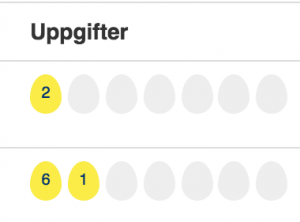
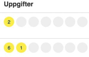
We are approaching easter, and I couldn’t resist to make eggs on the project I am working on these days:
Now:
Before
The trick is really easy. CSS border radius can be applied in ellipsis shapes. Each corner has a vertical and a horizontal radius. So you really just have to change the vertical radius of each corner like this:
And voila, the 60% and 40% vertical radius will do the trick.
I can highly recommend this really interesting presentation from Lea Verou on border-radius. It’s 14 minutes and highly worth the time.
Also, CSS Tricks has a collection of pre-cooked css shapes for inspiration: CSS-Tricks.com:ShapesOfCSS


March 31st, 2015 at 09:59 (GMT-1)
Nice! I’ll have a look and maybe do something with it next weekend.
April 1st, 2015 at 09:11 (GMT-1)
Approaching easter so we will do best
April 17th, 2015 at 13:42 (GMT-1)
interesting write-up
April 24th, 2015 at 11:17 (GMT-1)
Haha brilliant easter egg! Did not know it was that simple. Can we expect a tree just before christmas? :)))